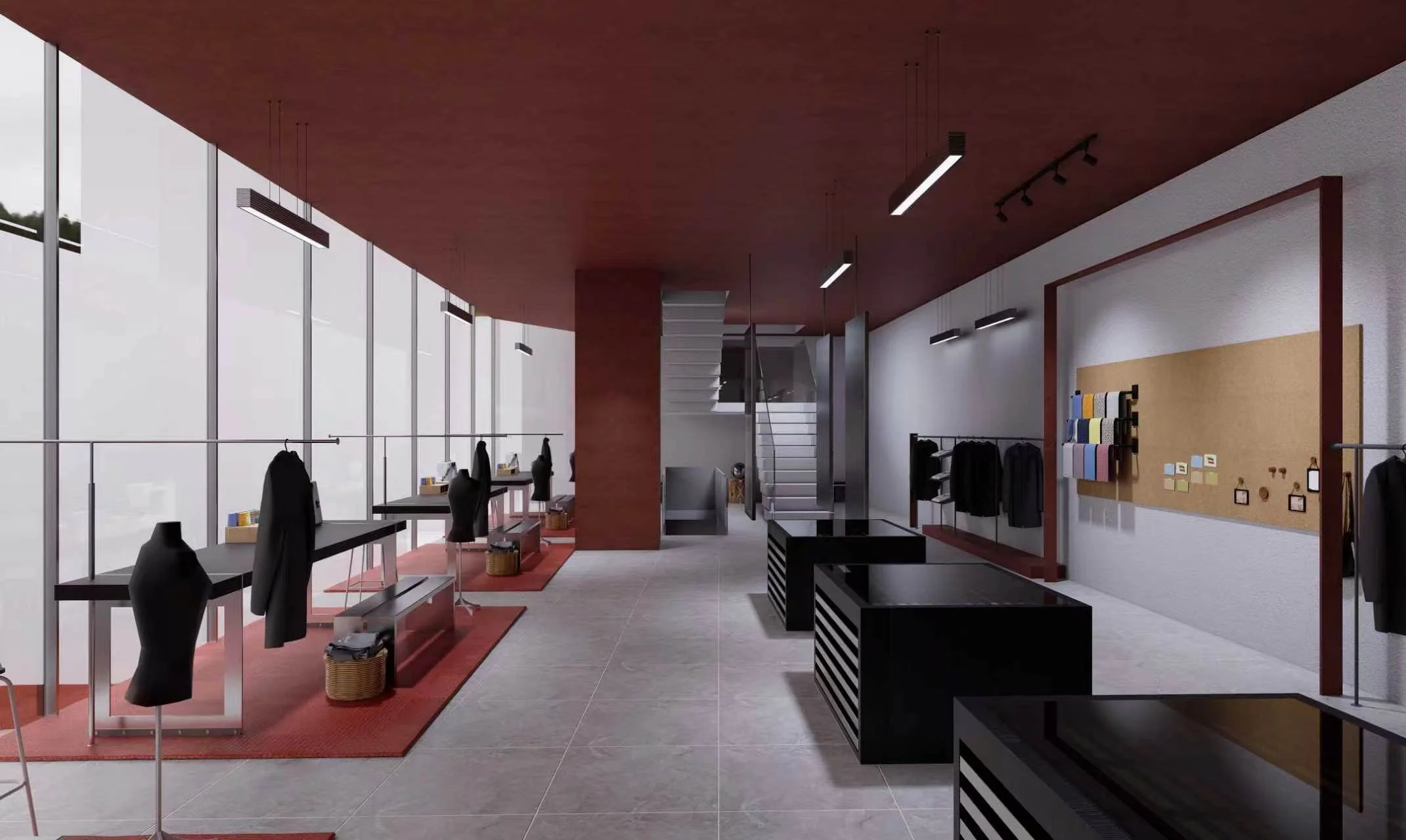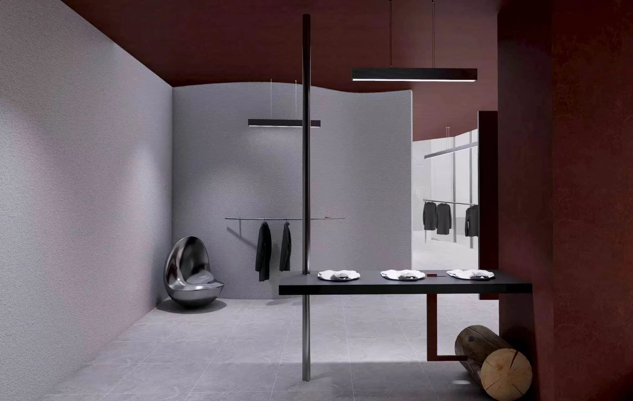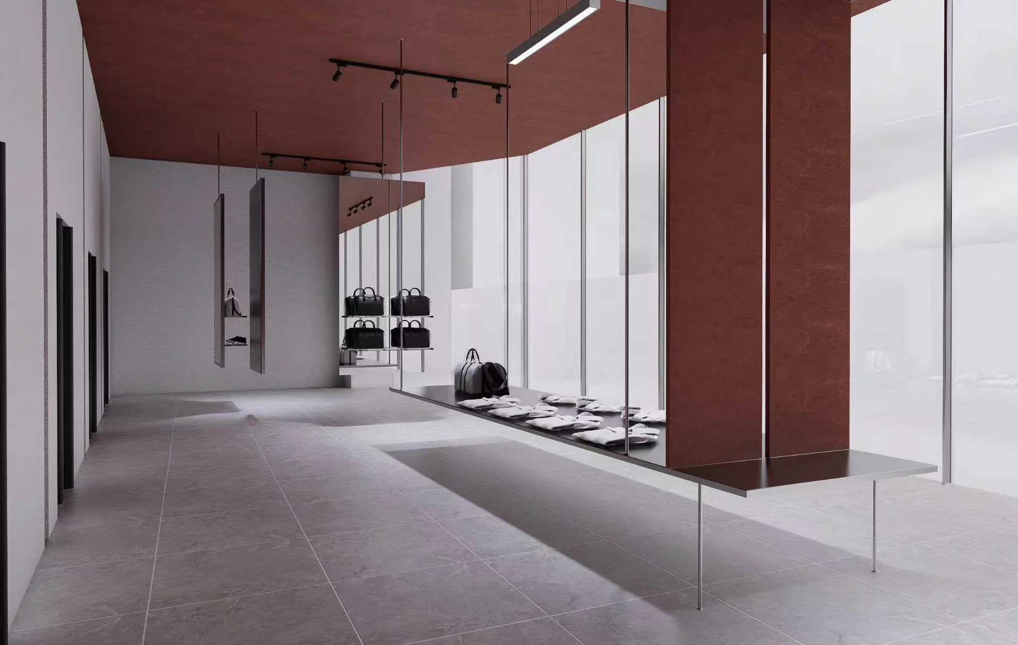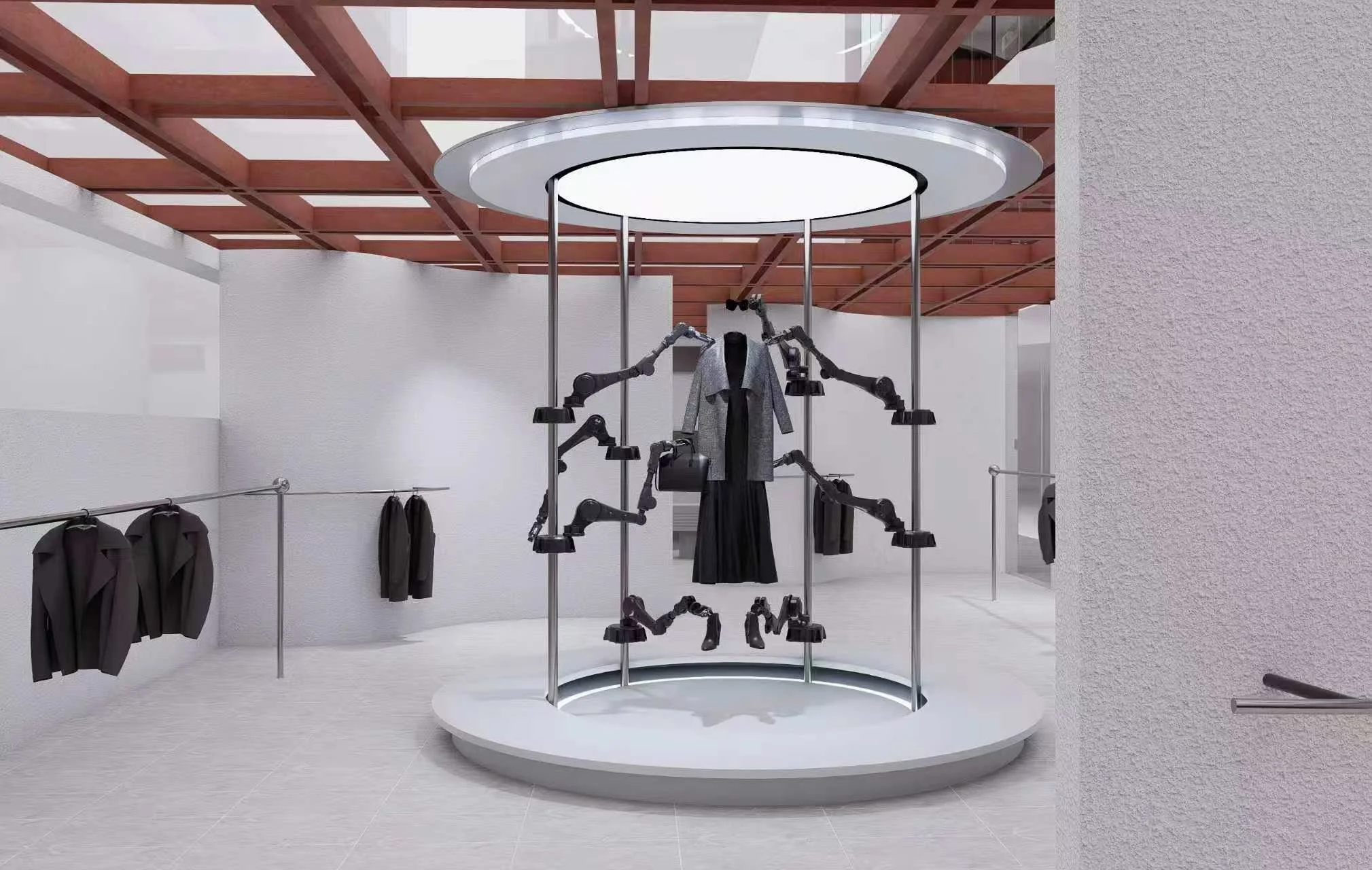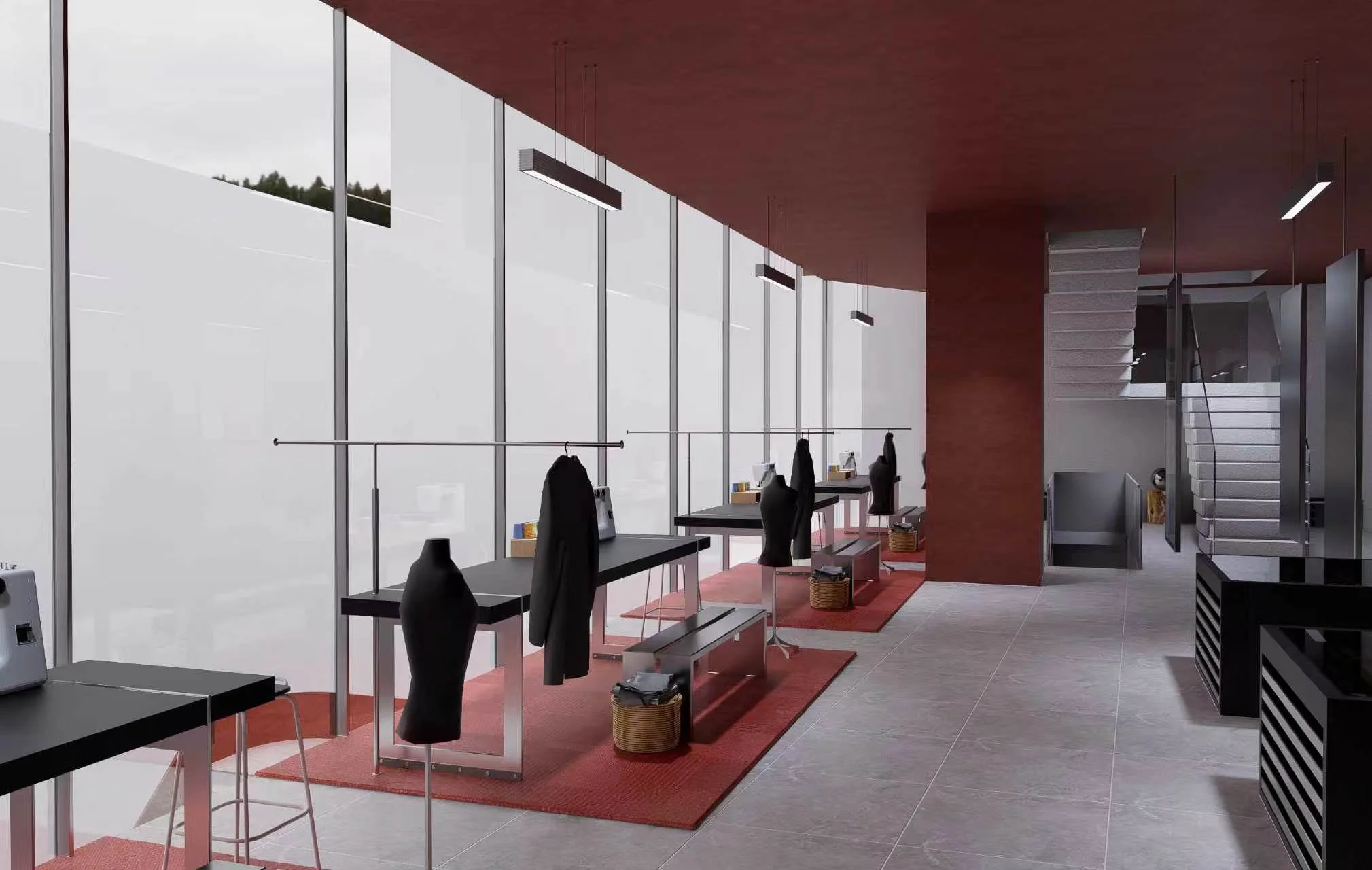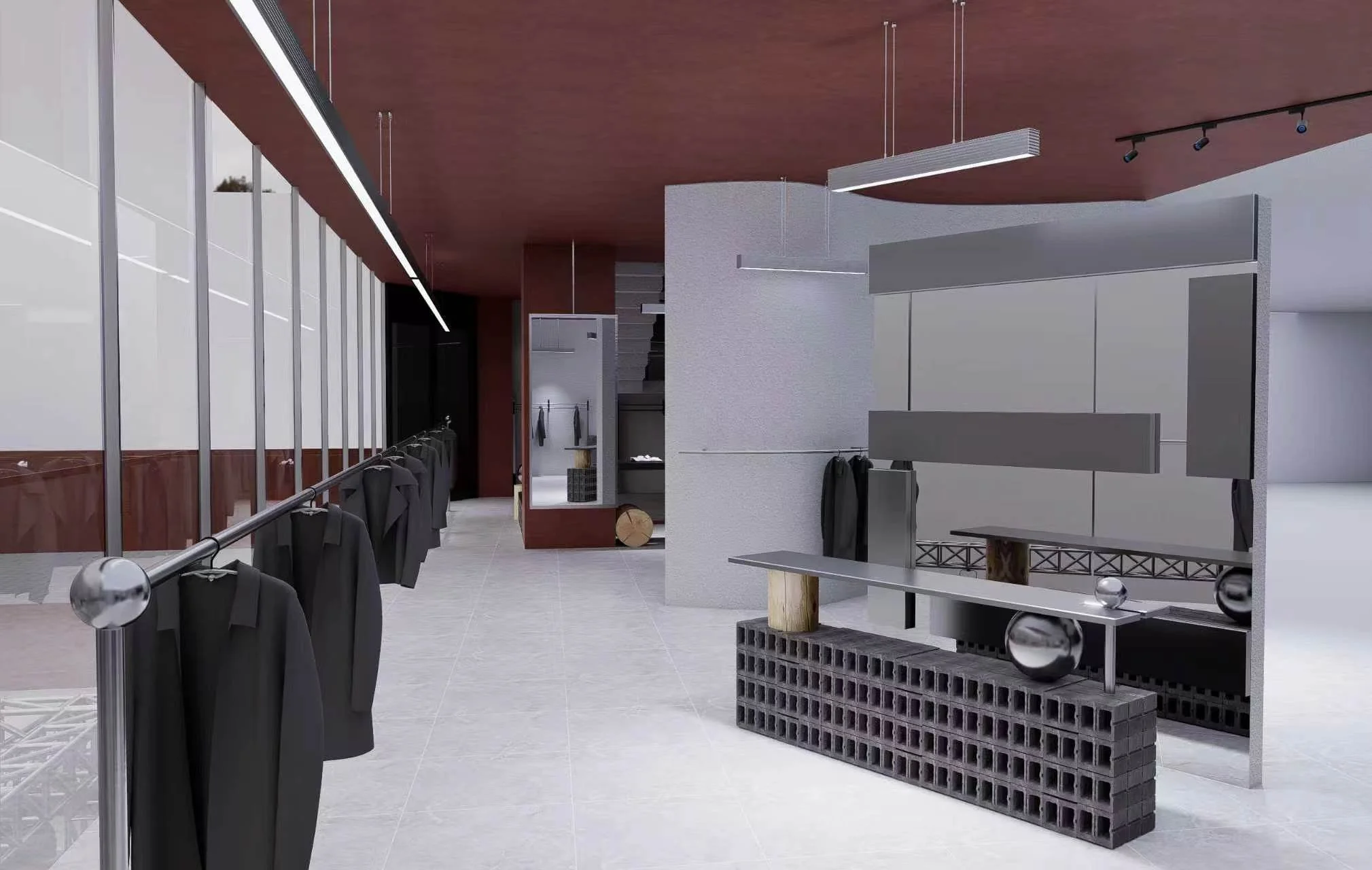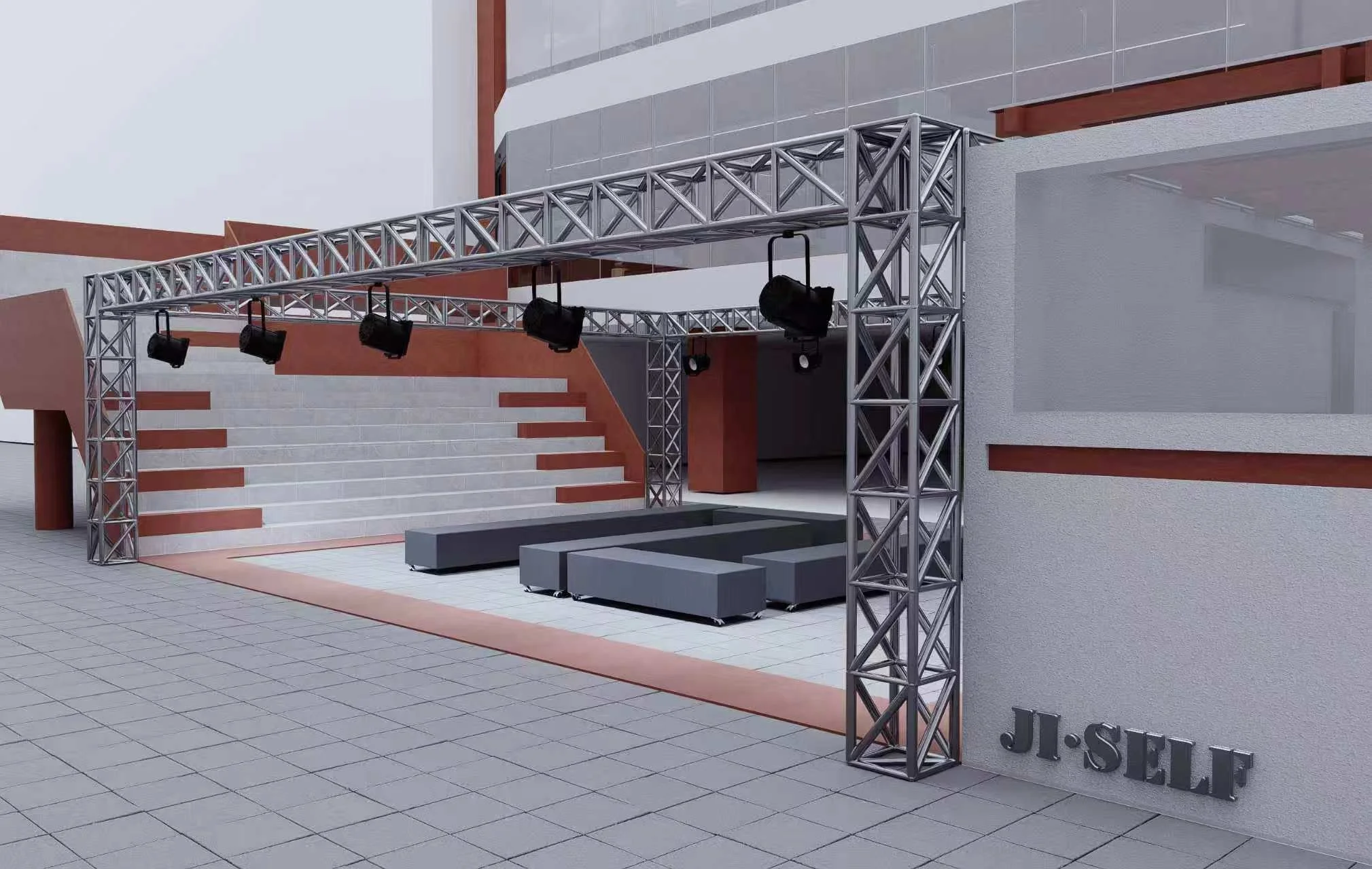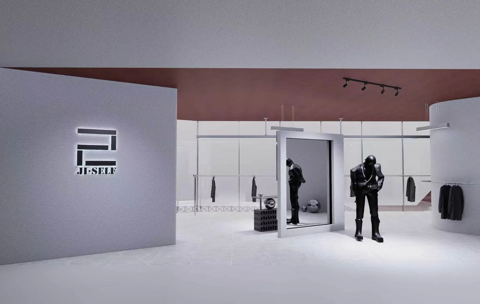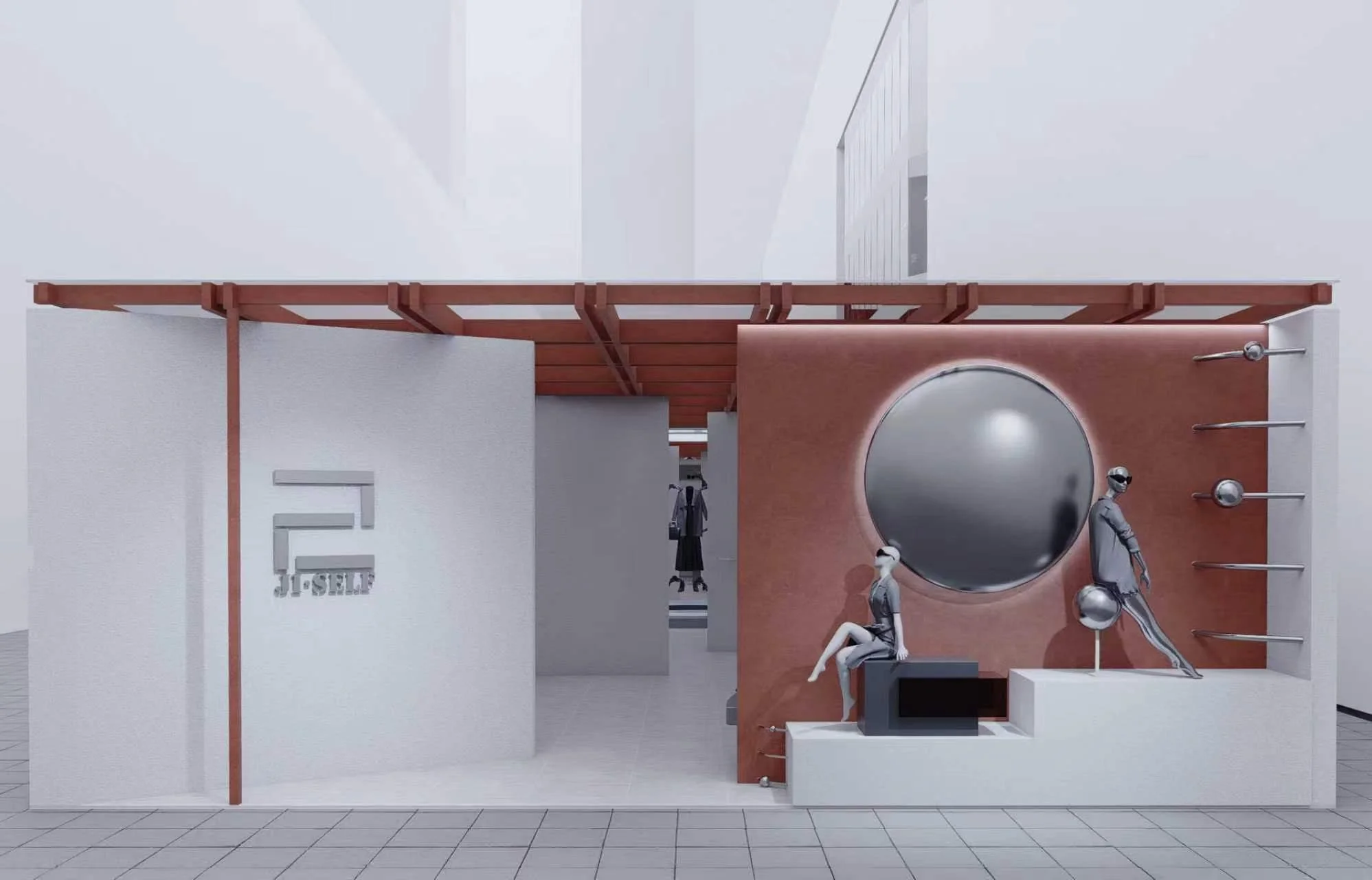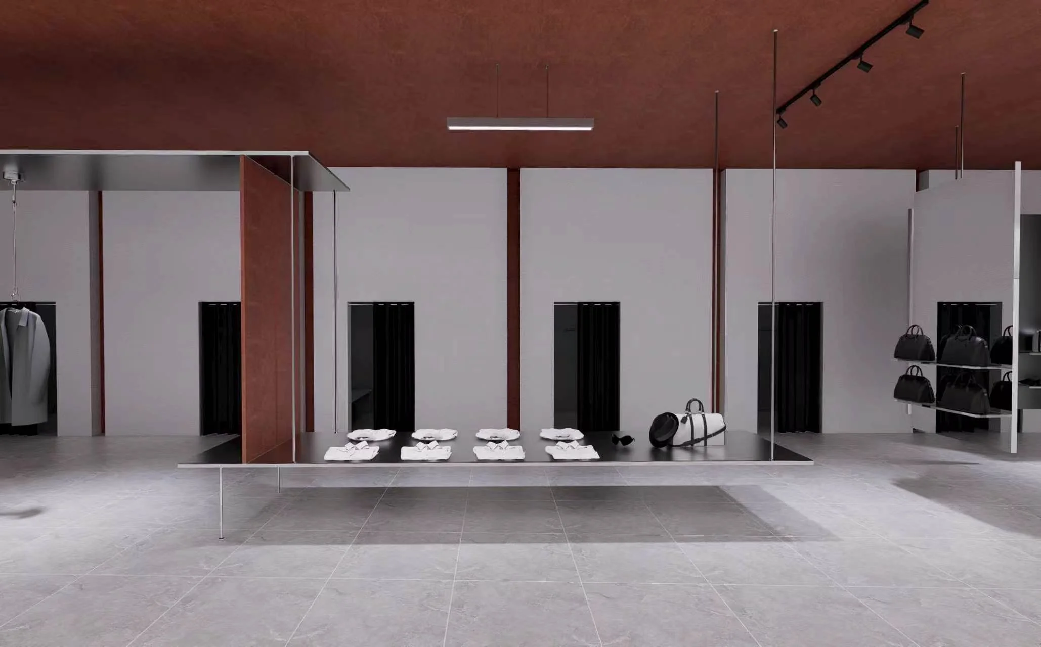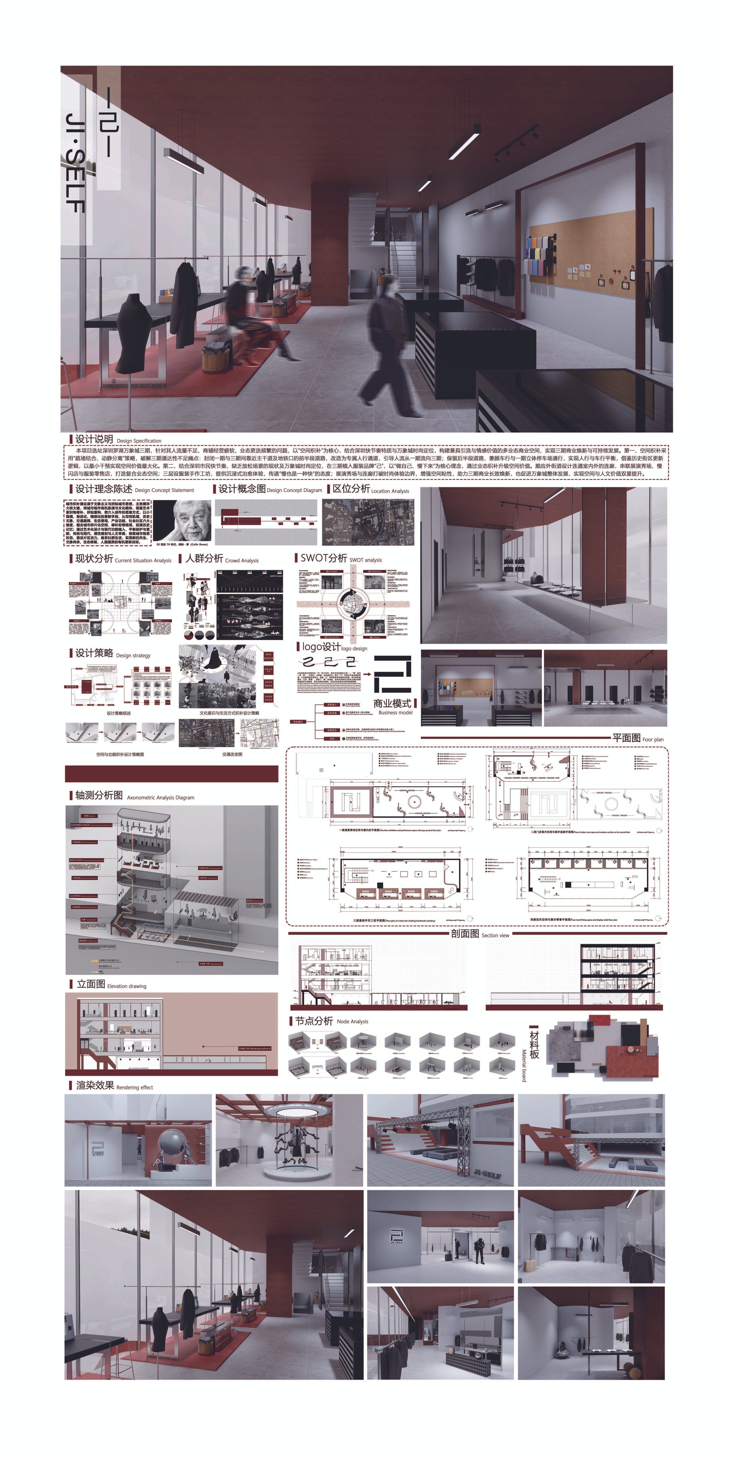
JI/SELF
Design Theory
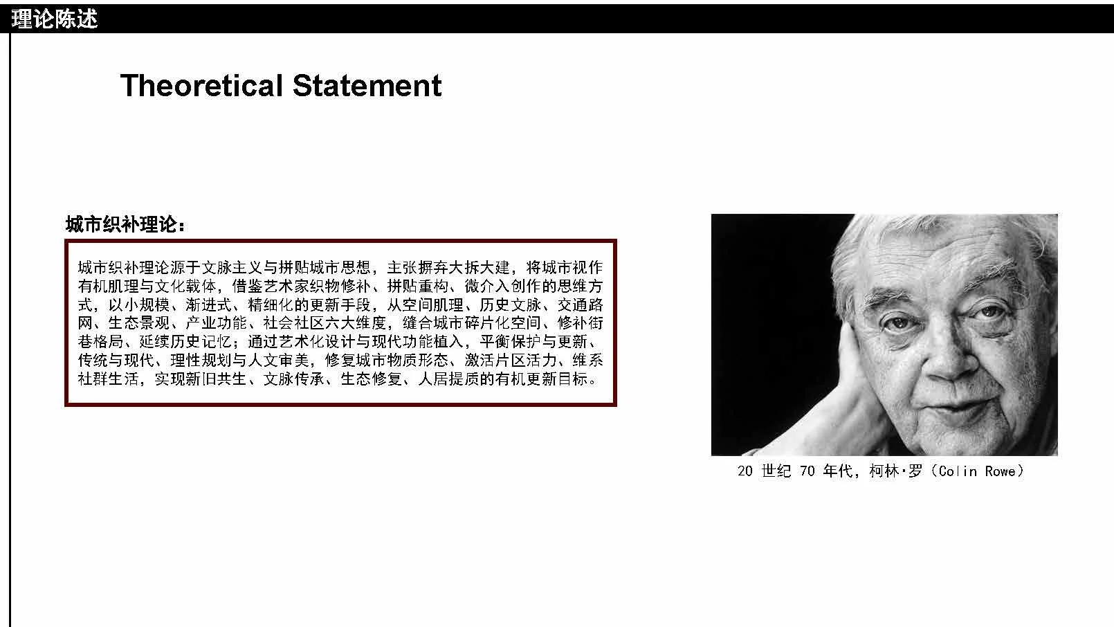
Rooted in the contextualism and "collage city" thinking advanced by Colin Rowe in the 1970s, urban stitching rejects wholesale demolition and instead treats the city as an organic fabric and cultural vessel.
Taking the micro-interventionist mindset of textile mending and collage, it applies small-scale, incremental, and finely tuned renewal across six dimensions — spatial fabric, historical context, transport networks, ecological landscape, industrial function, and social community — stitching the city's fragments back together, extending its memory, and balancing preservation with renewal toward an organic regeneration of old-new symbiosis and improved urban living.
Design Strategy
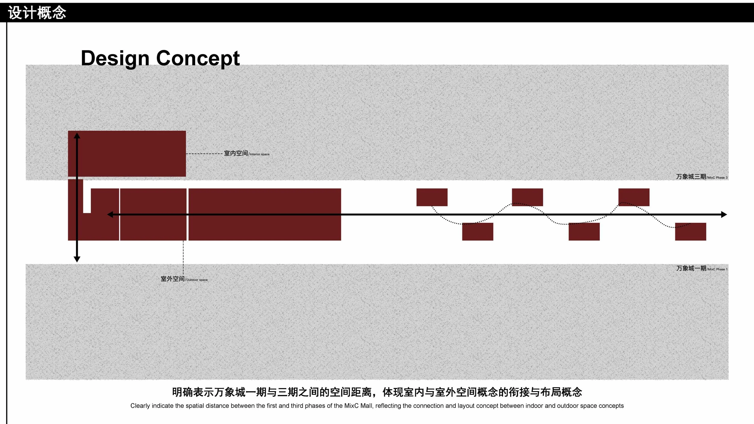
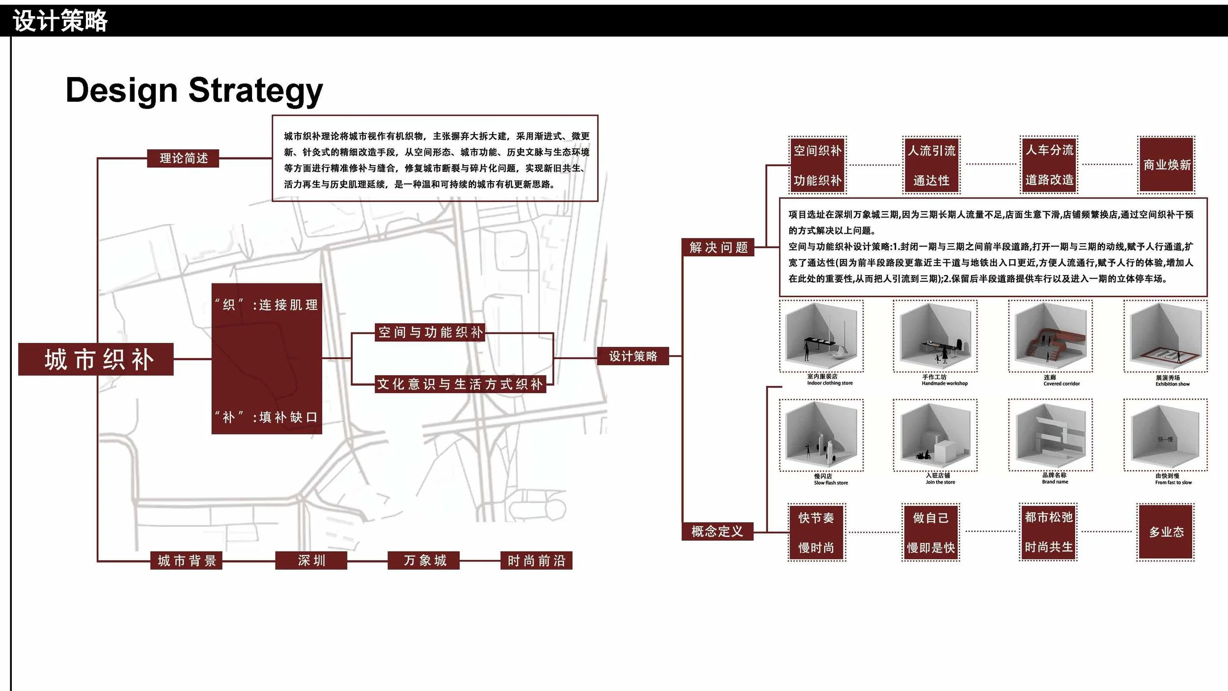
The design "weaves" to connect the urban fabric and "mends" to fill its gaps, operating on two levels.
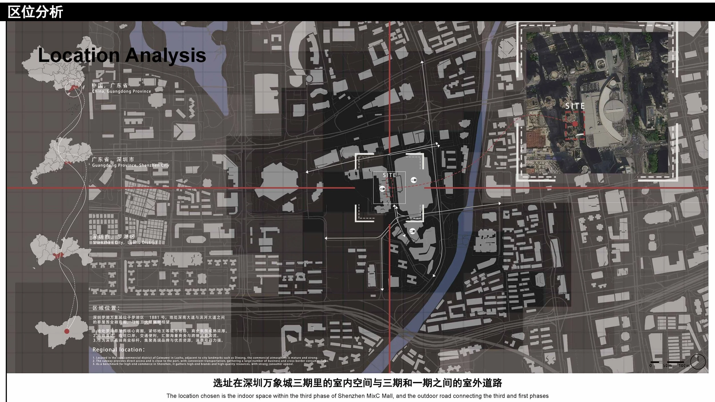
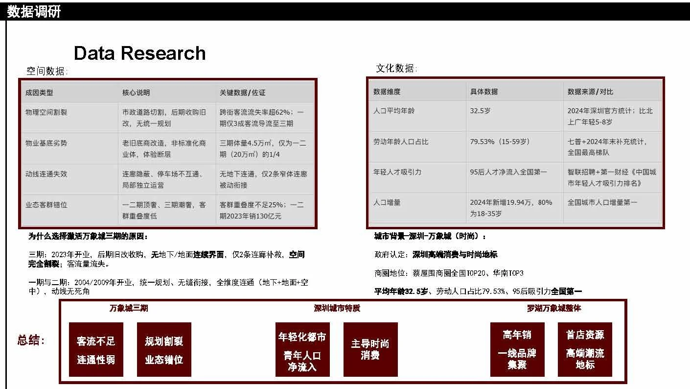
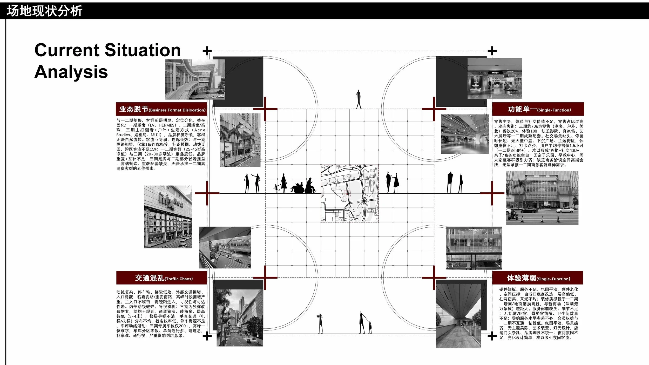
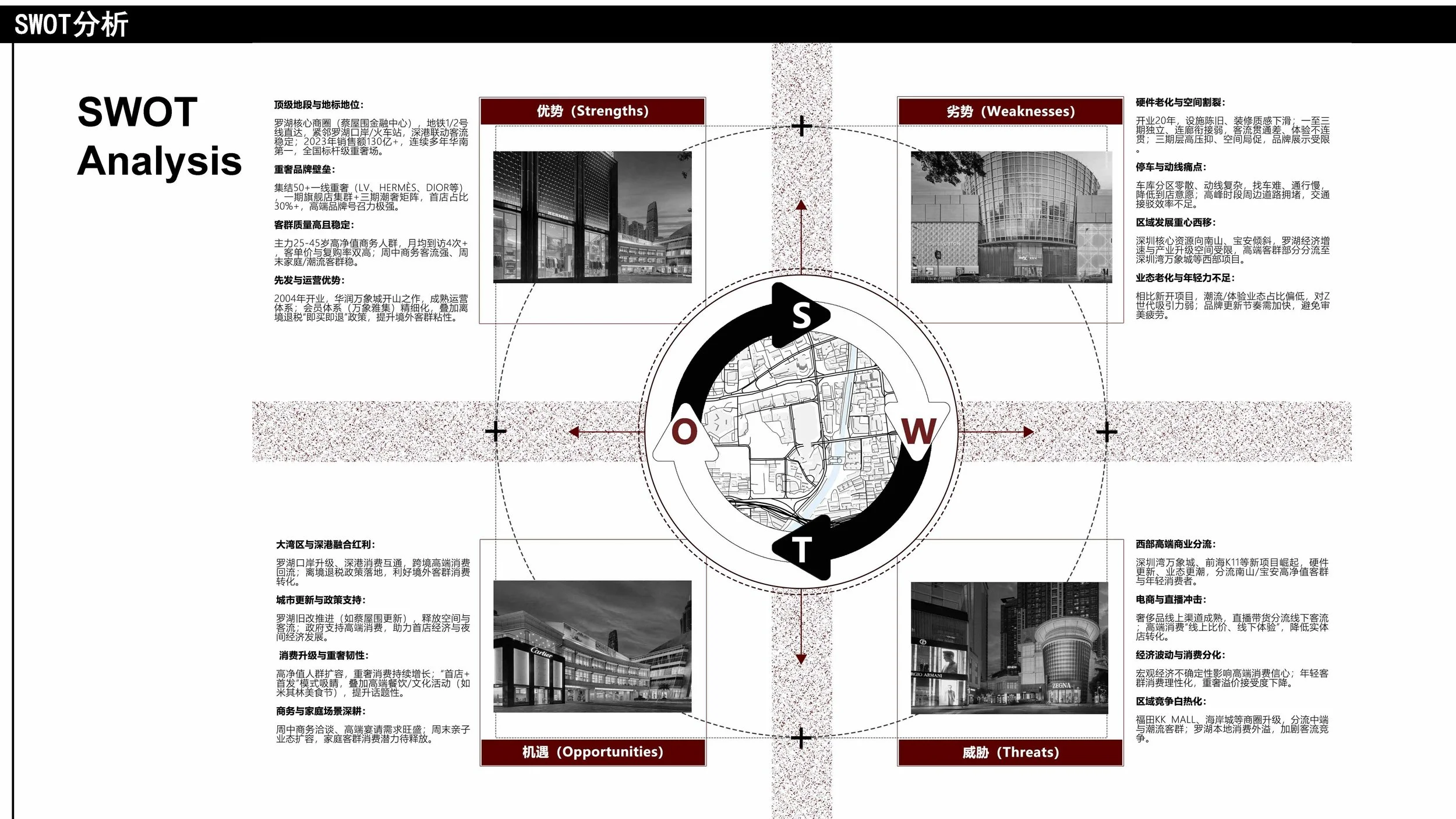
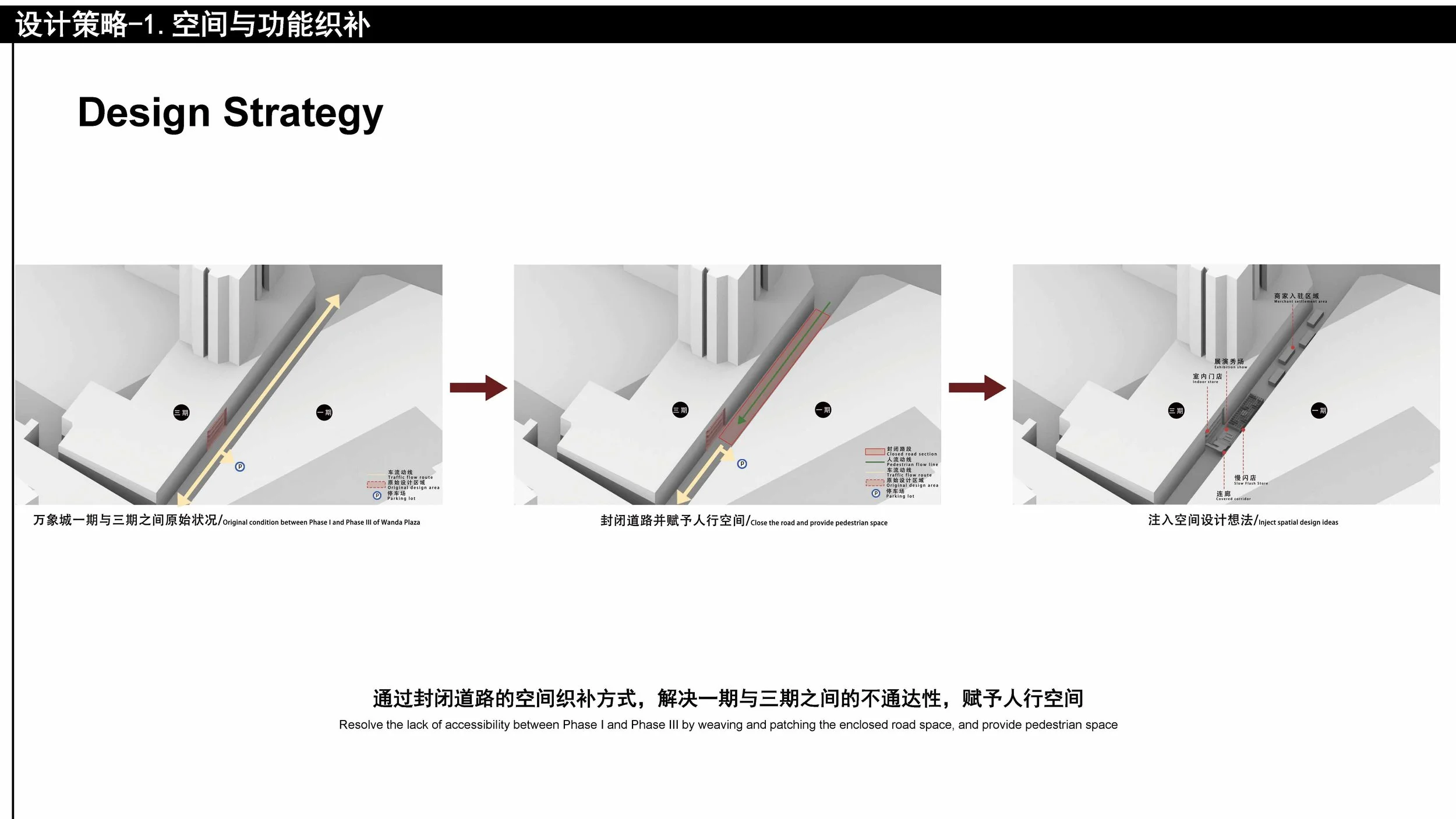
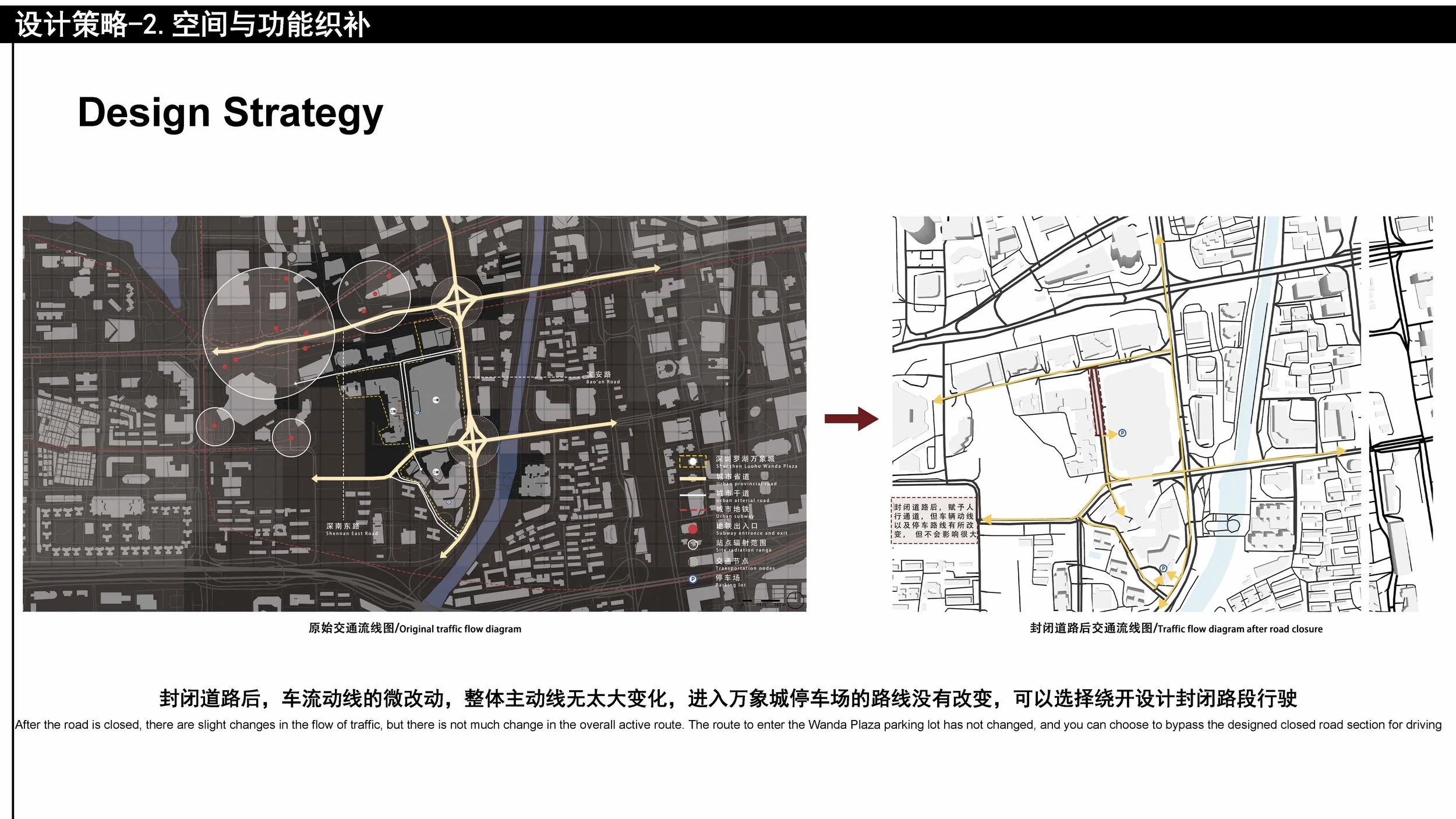
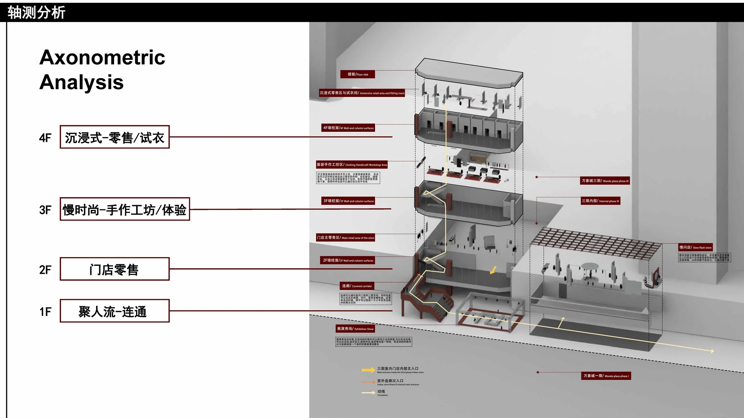
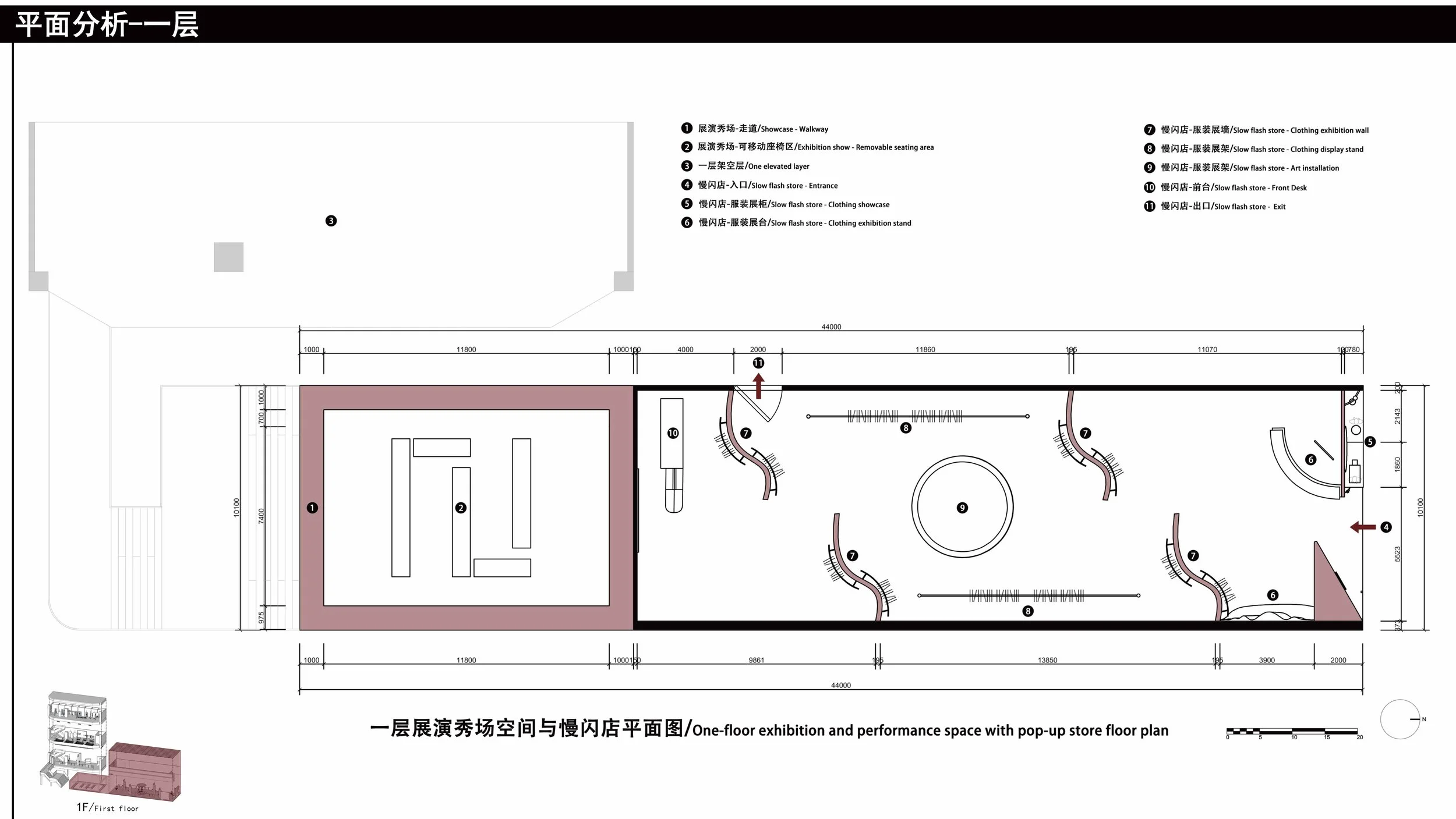
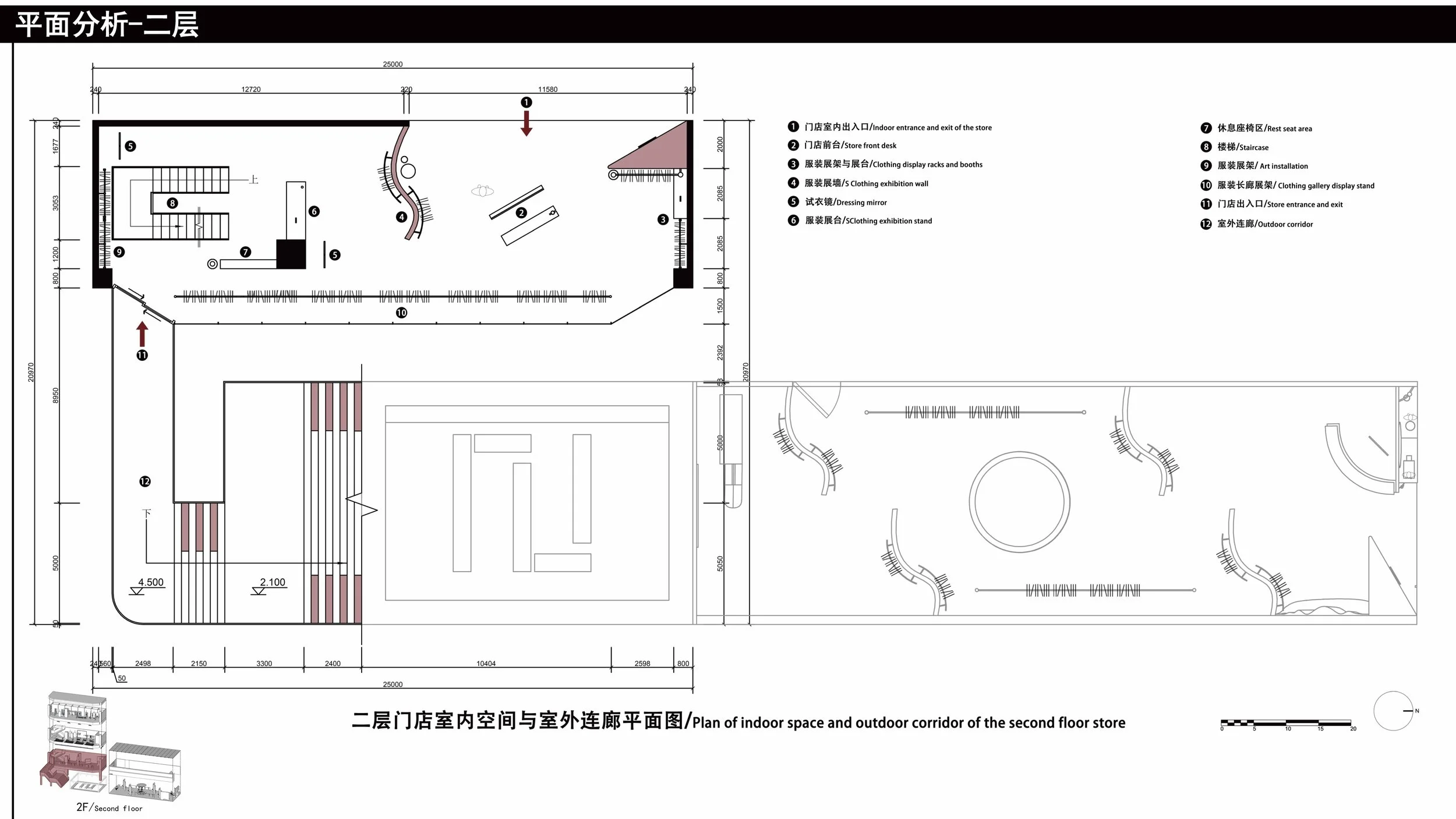
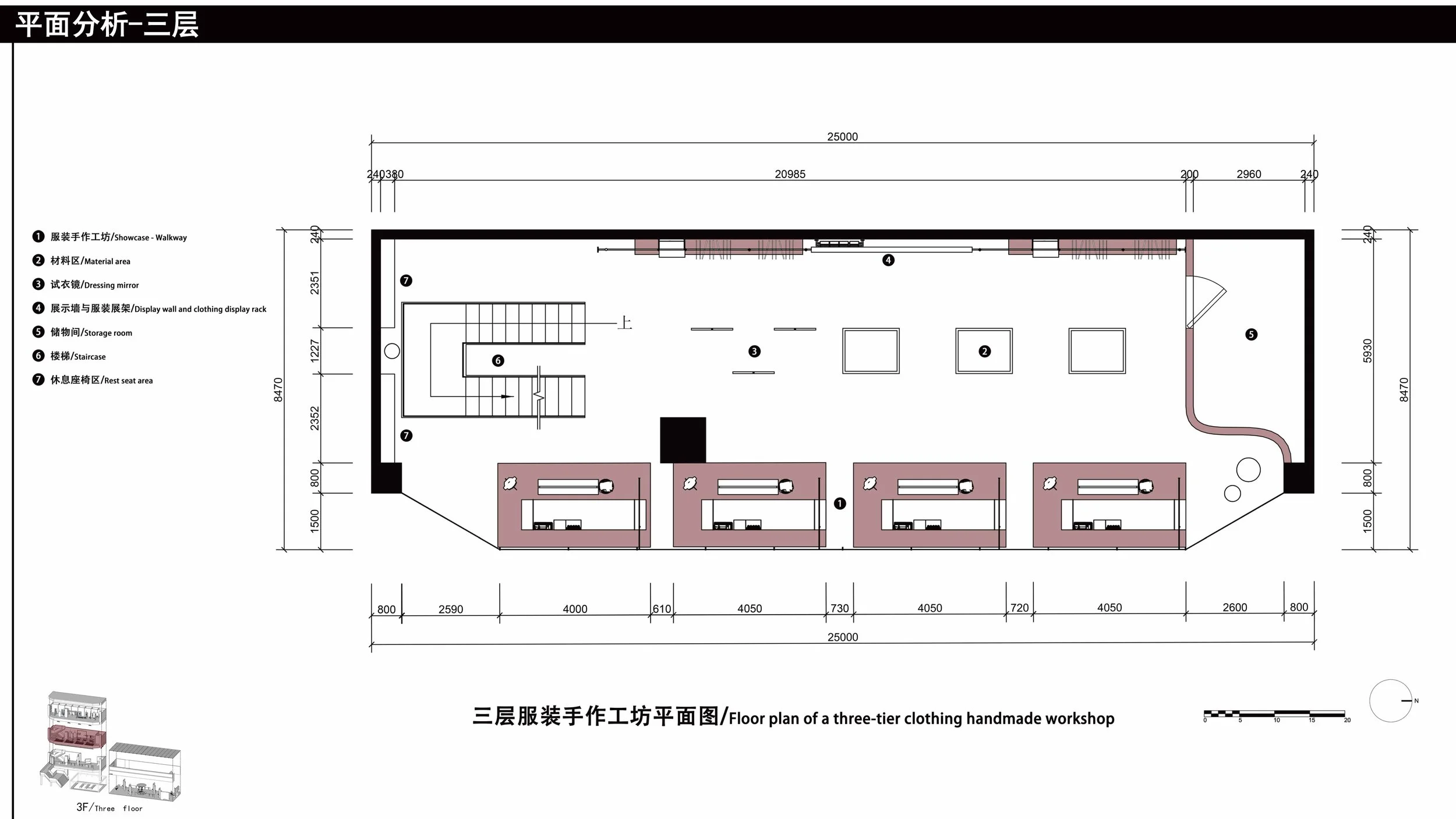
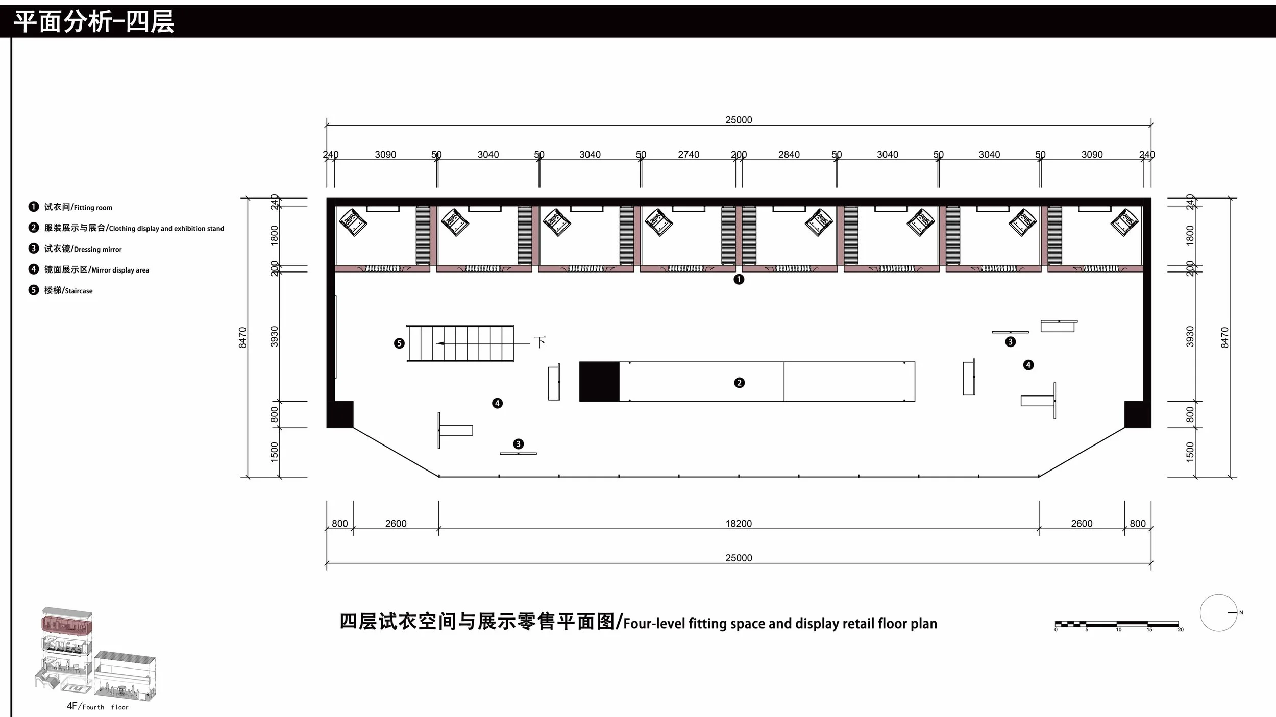
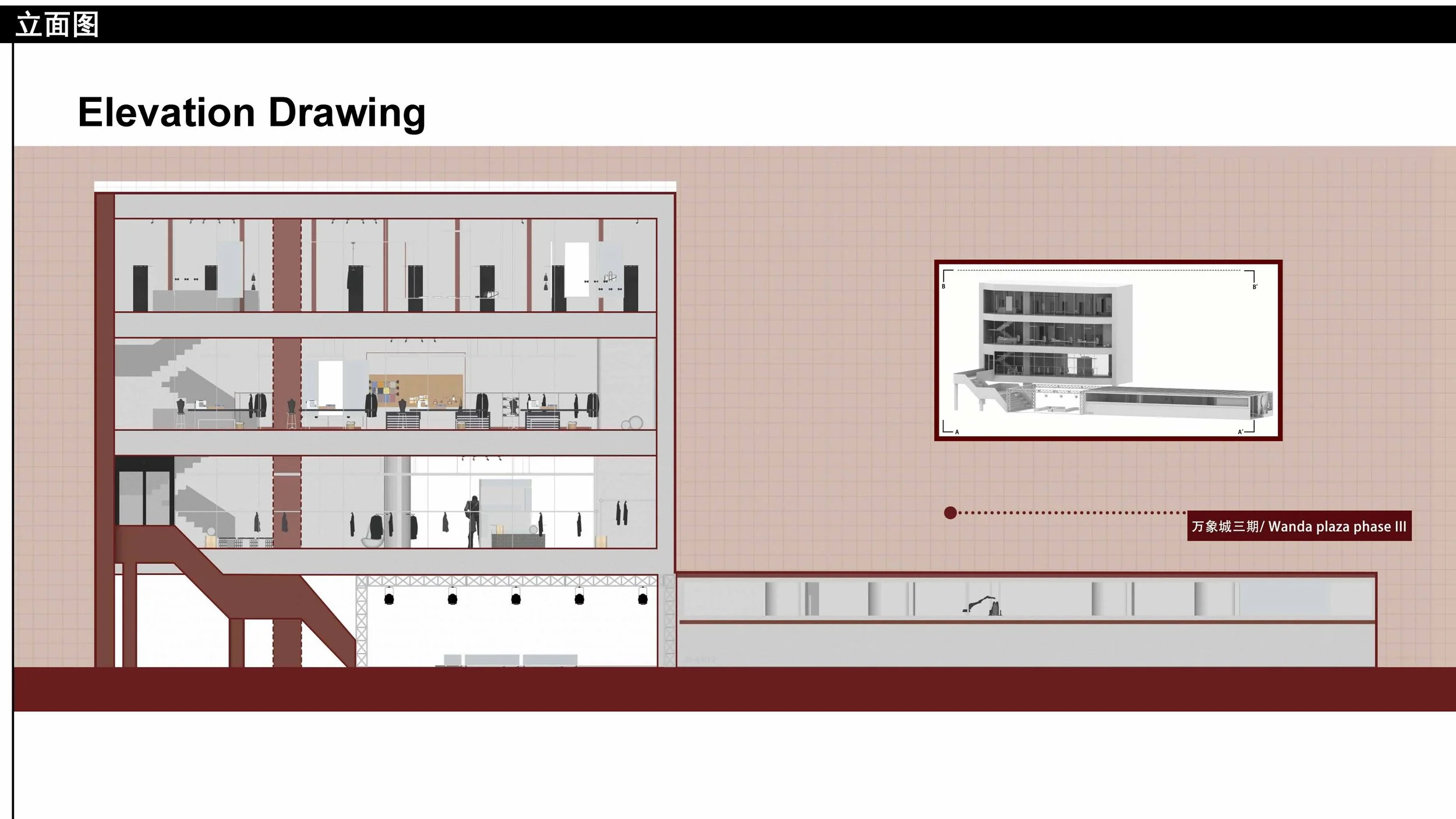
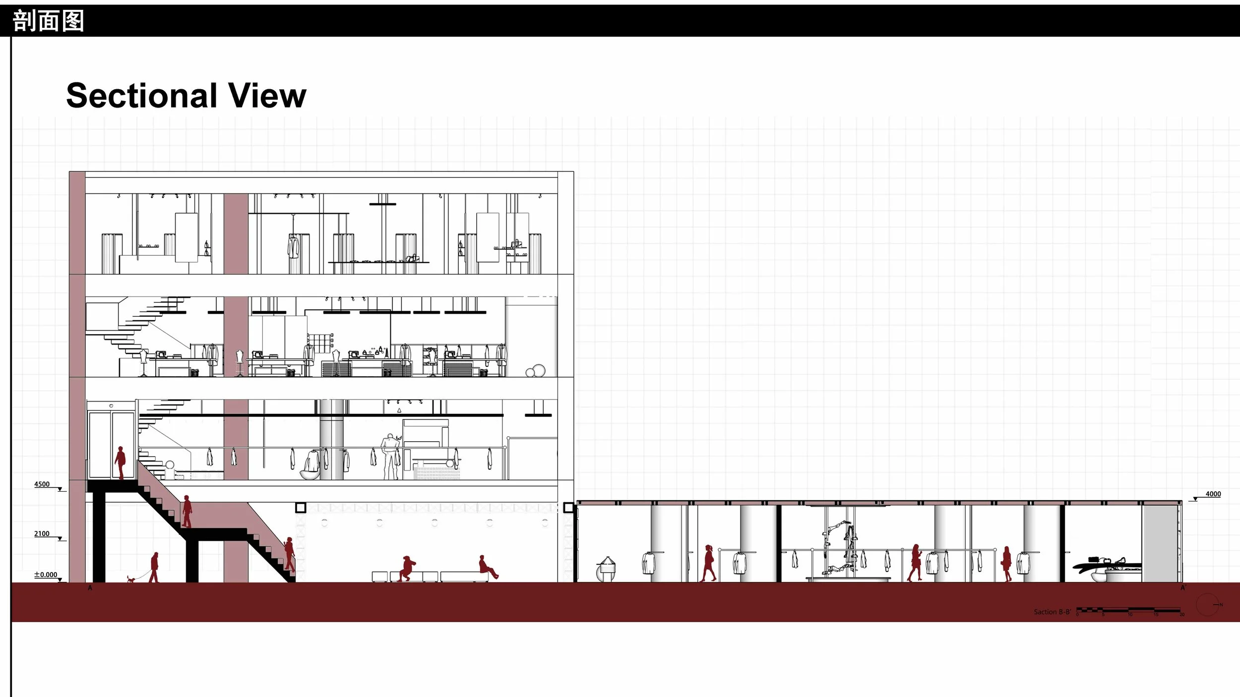
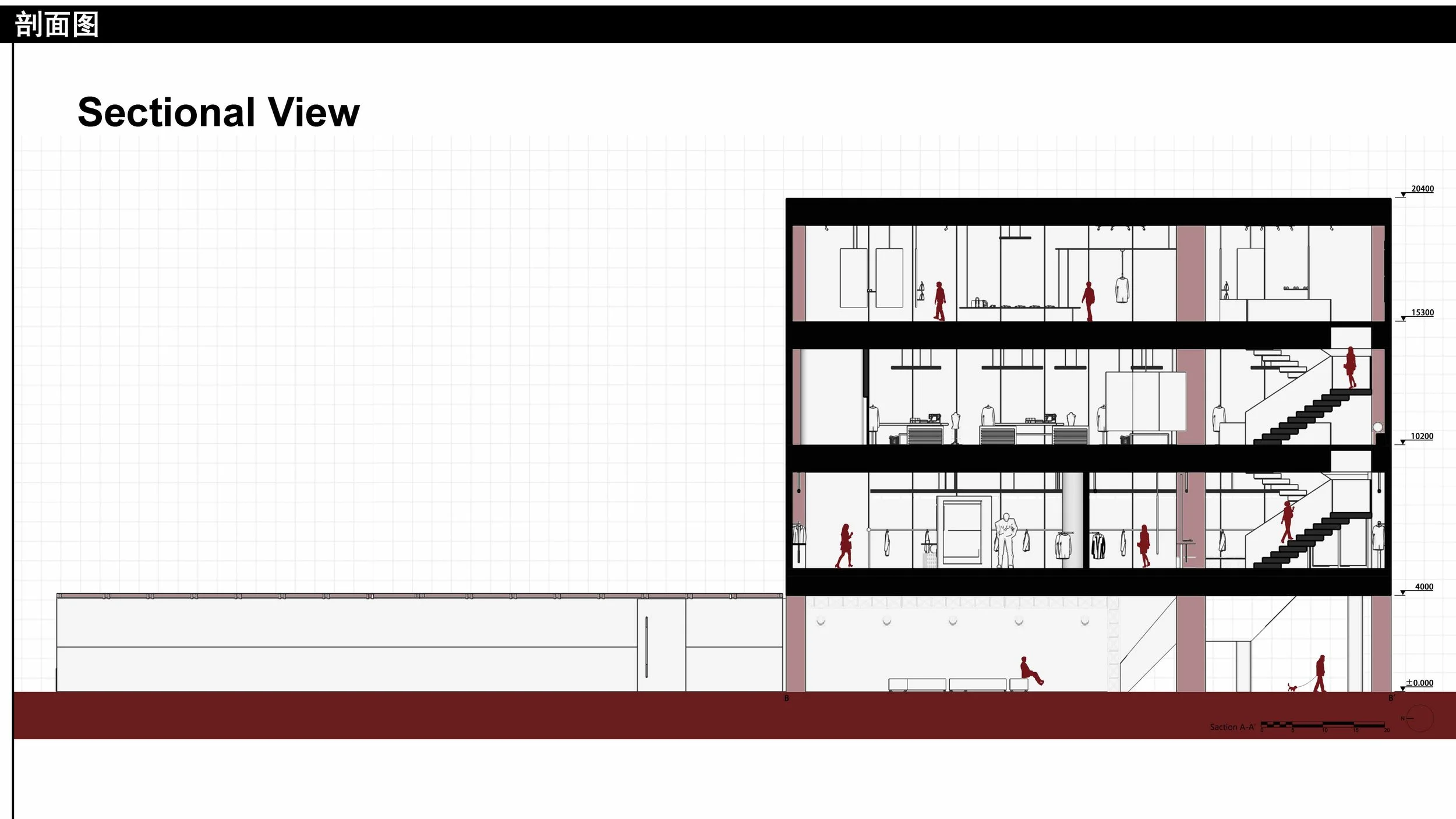
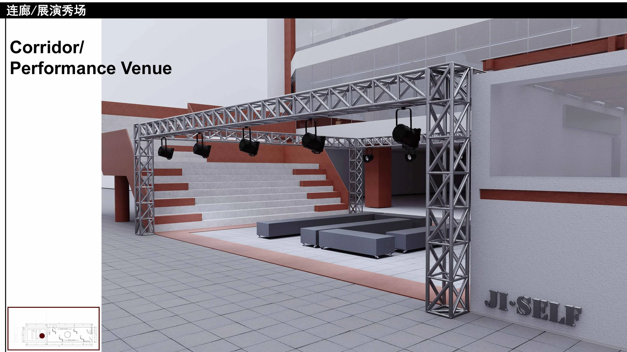
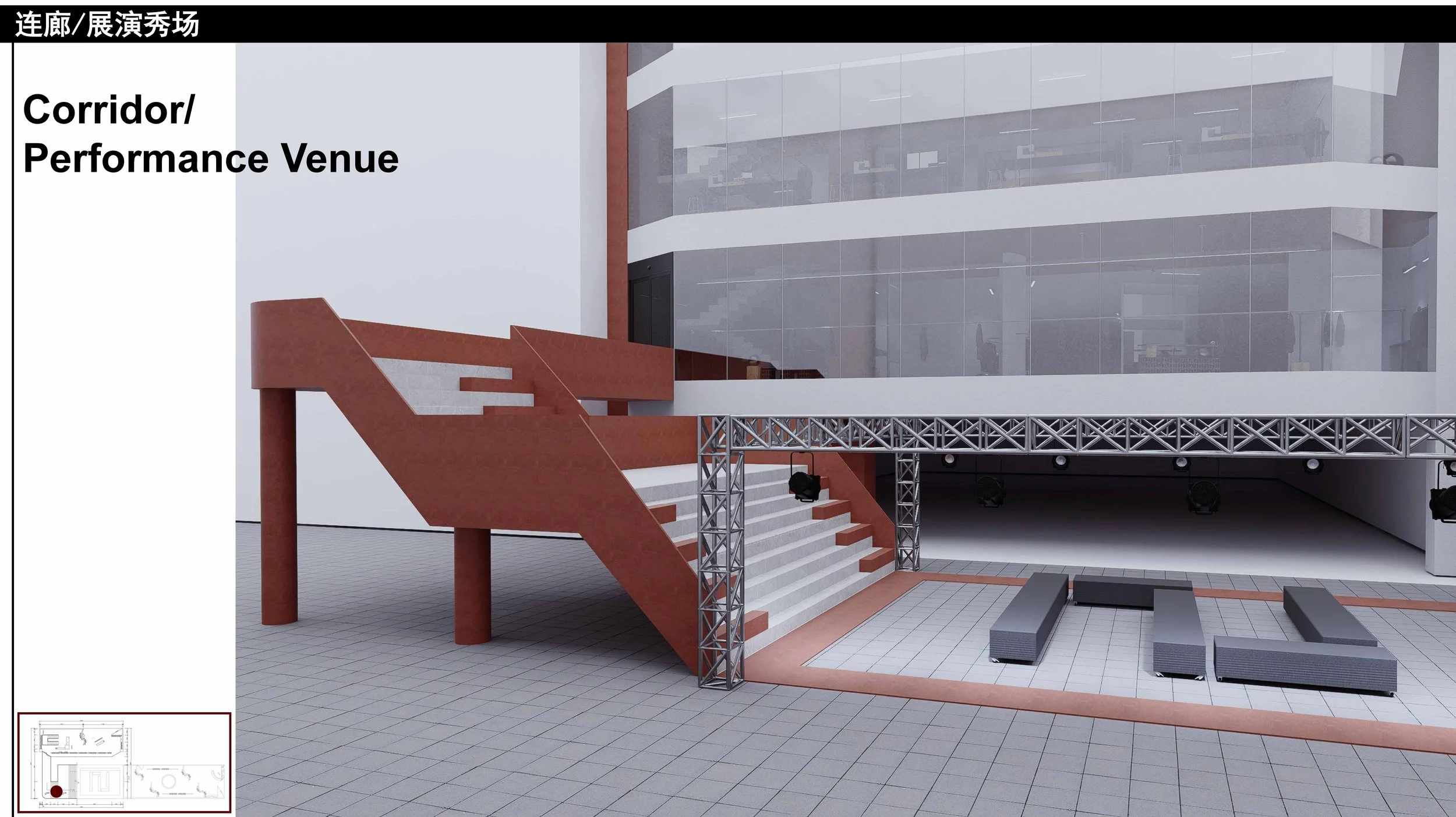
Spatial and functional stitching: in response to Phase III's insufficient footfall and fading vitality, the front section of the passage between Phase I and Phase III is opened as a pedestrian route, drawing crowds inward through its proximity to the main road and metro entrances, while the rear section retains vehicular access to the Phase I parking structure — achieving pedestrian-vehicle separation and commercial renewal.
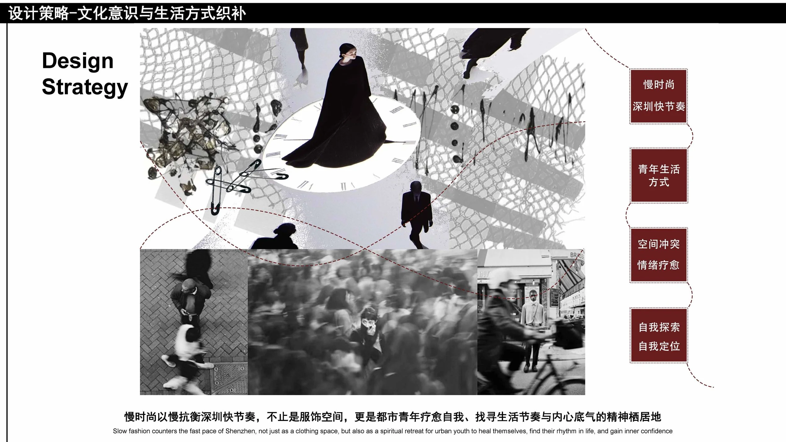
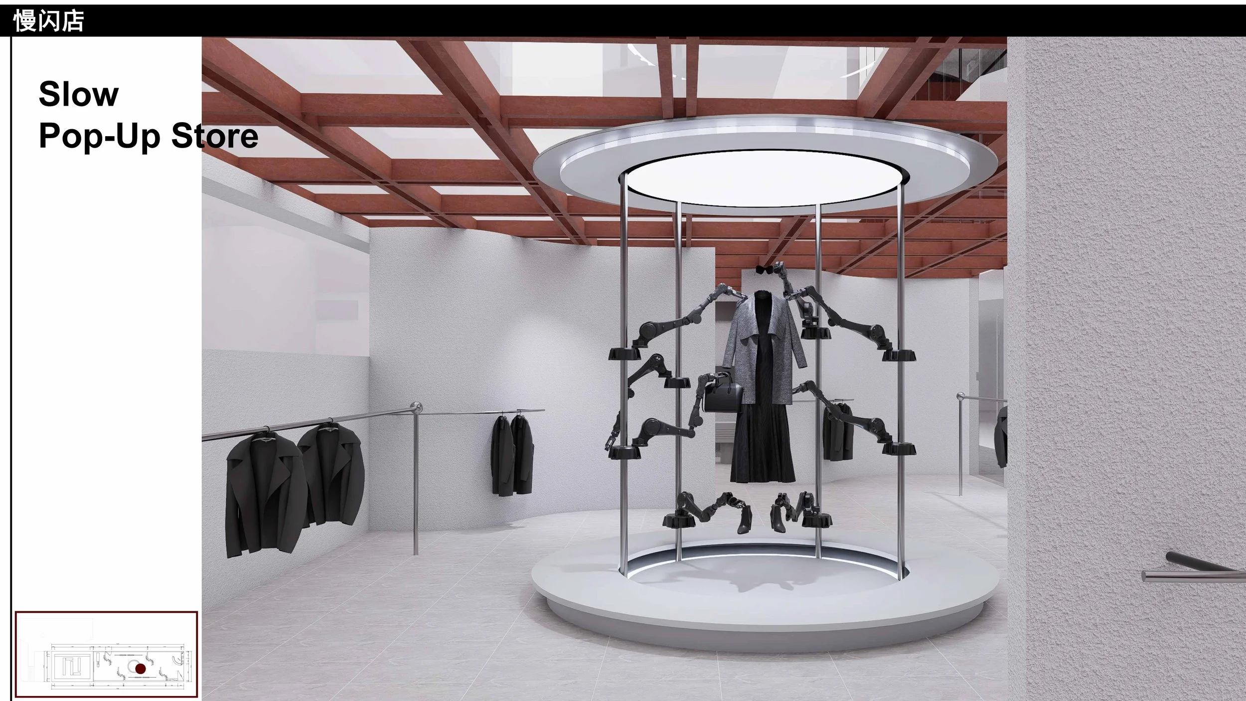
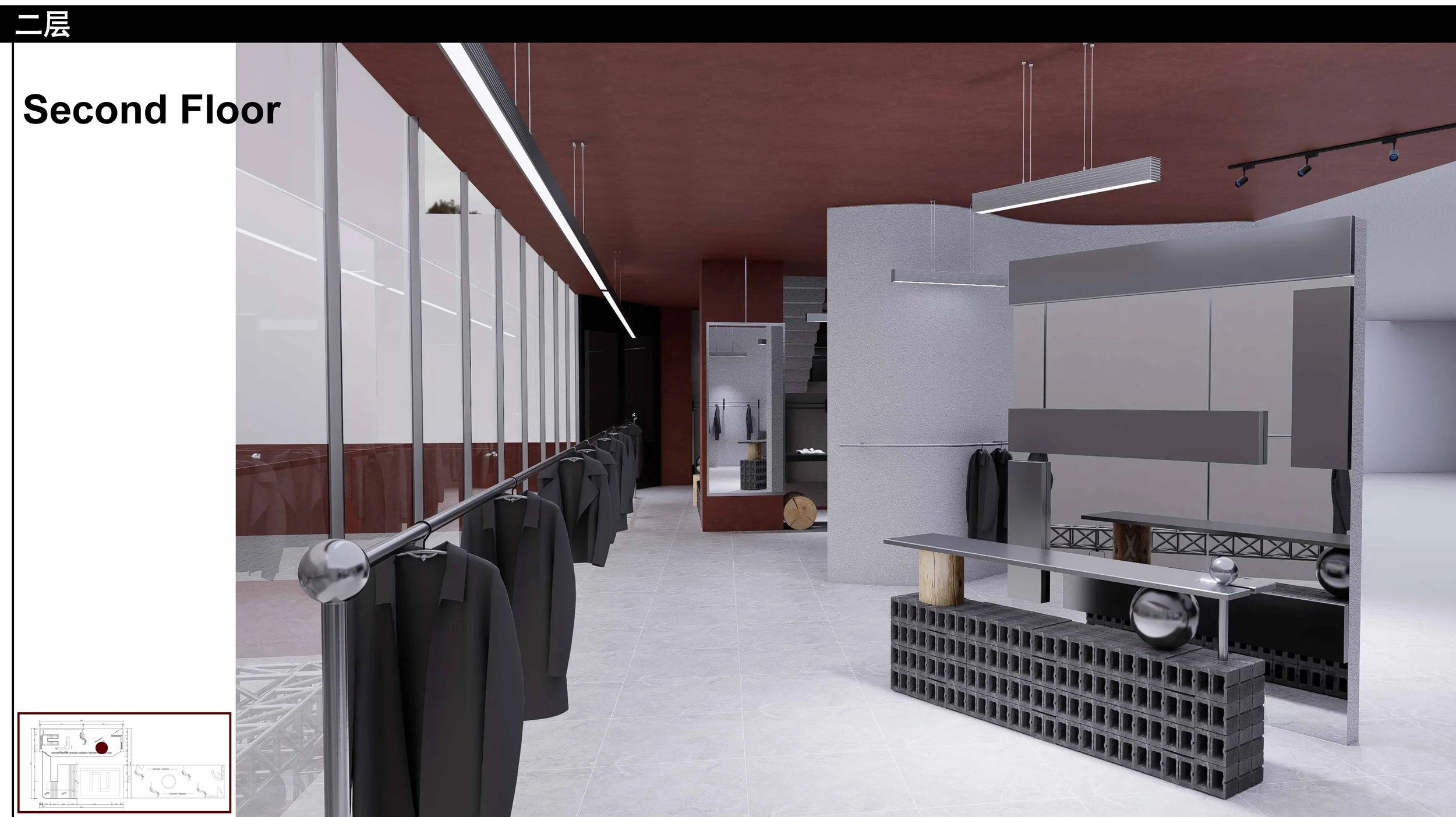
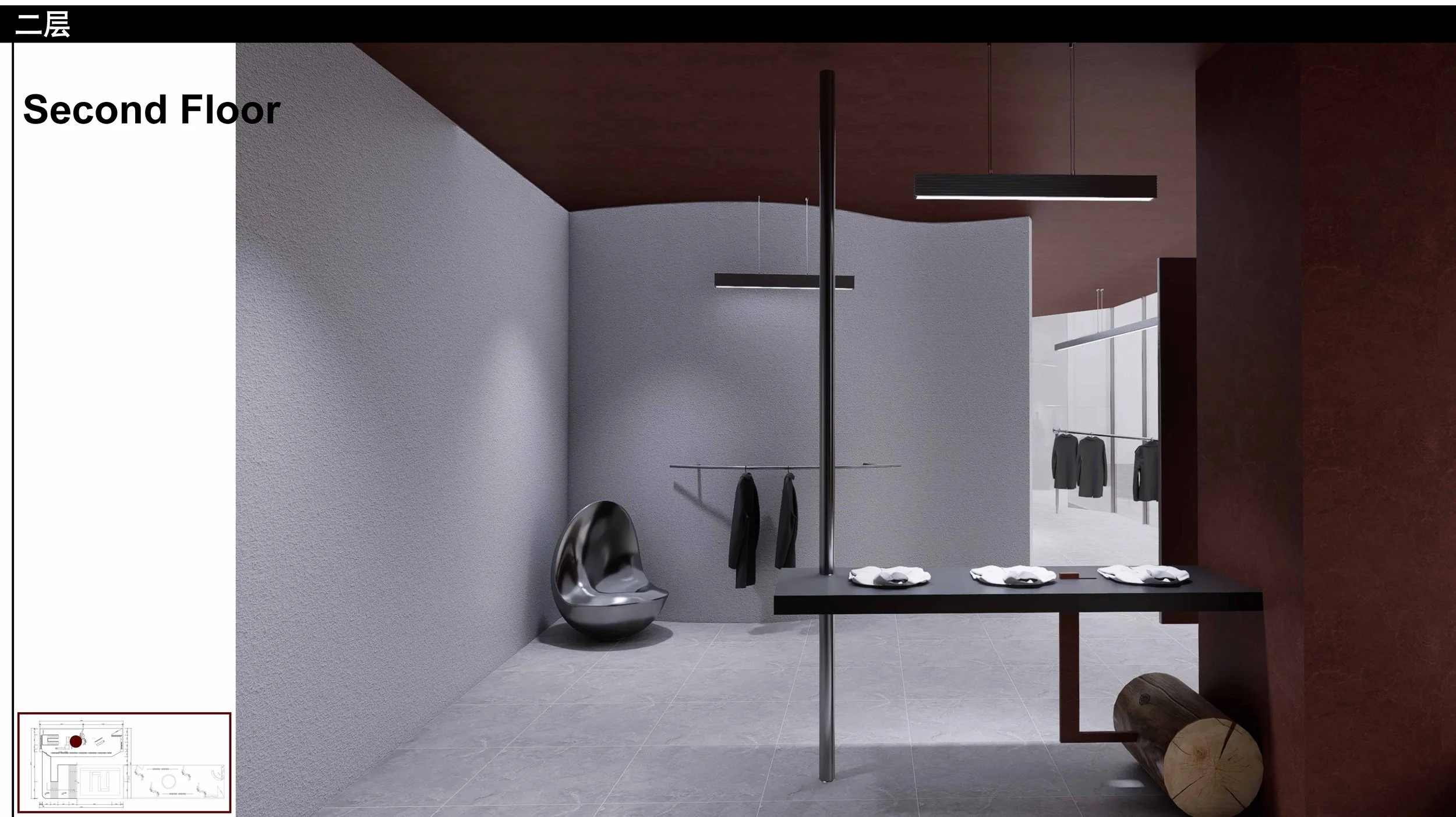
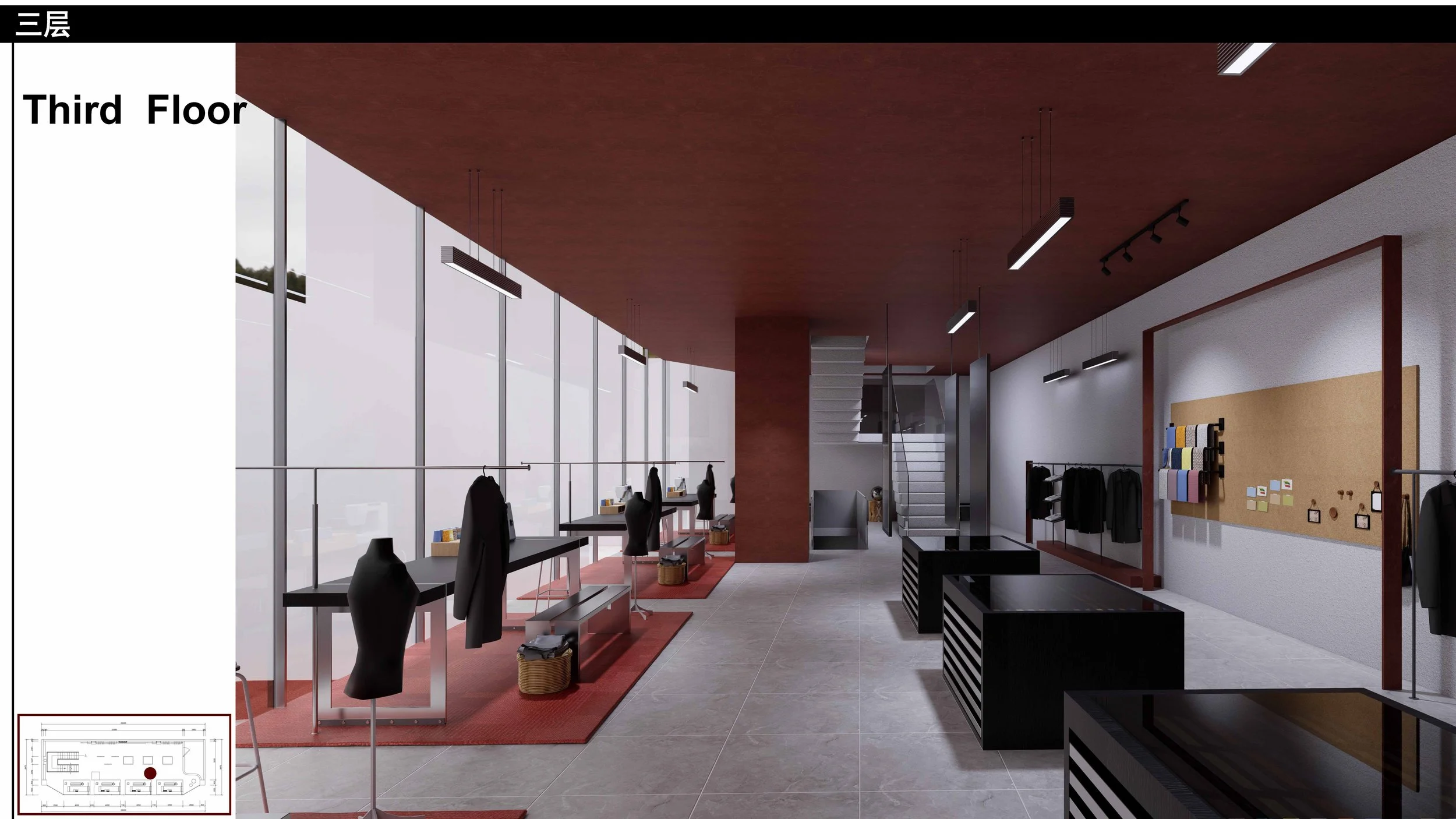
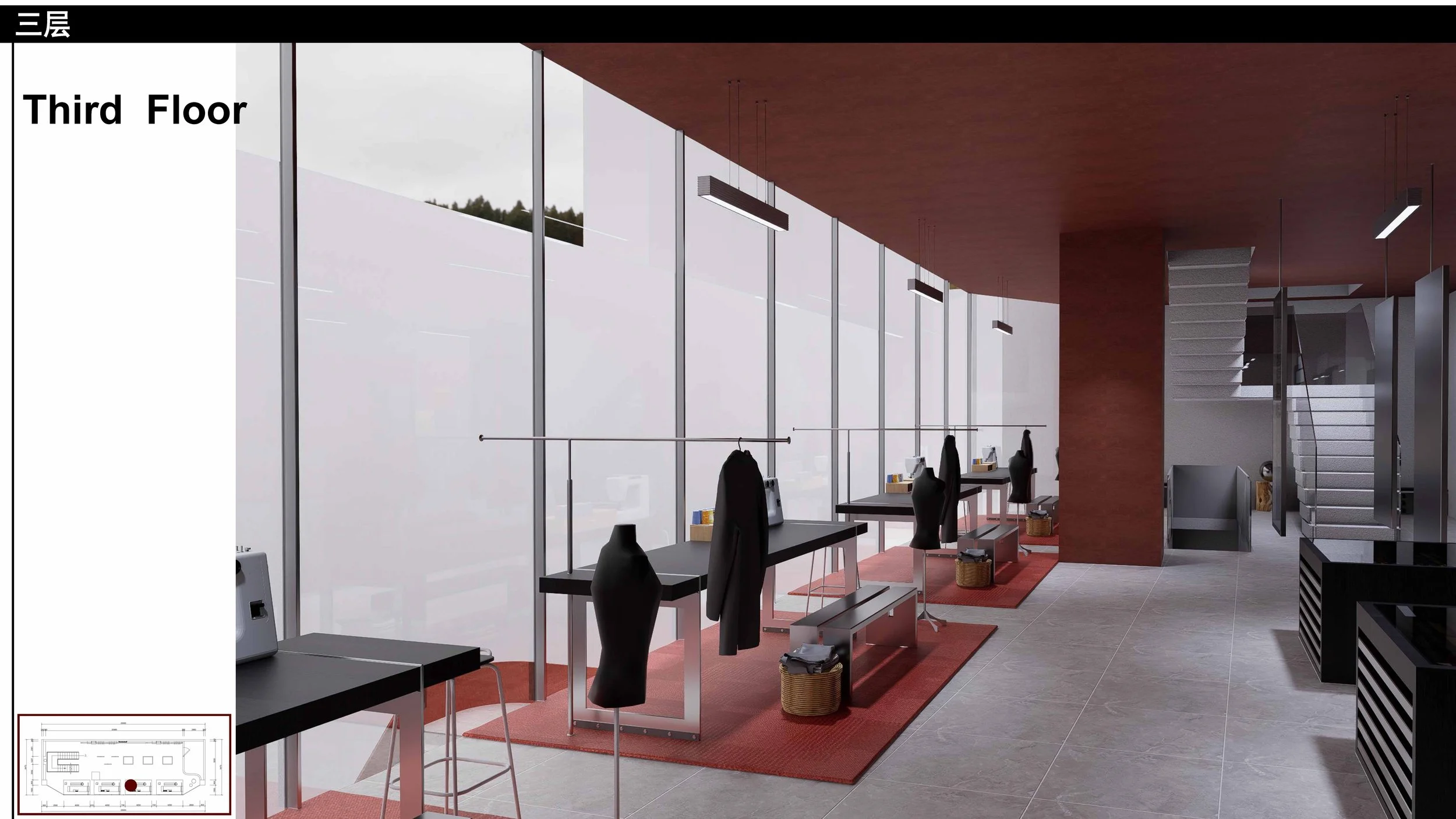
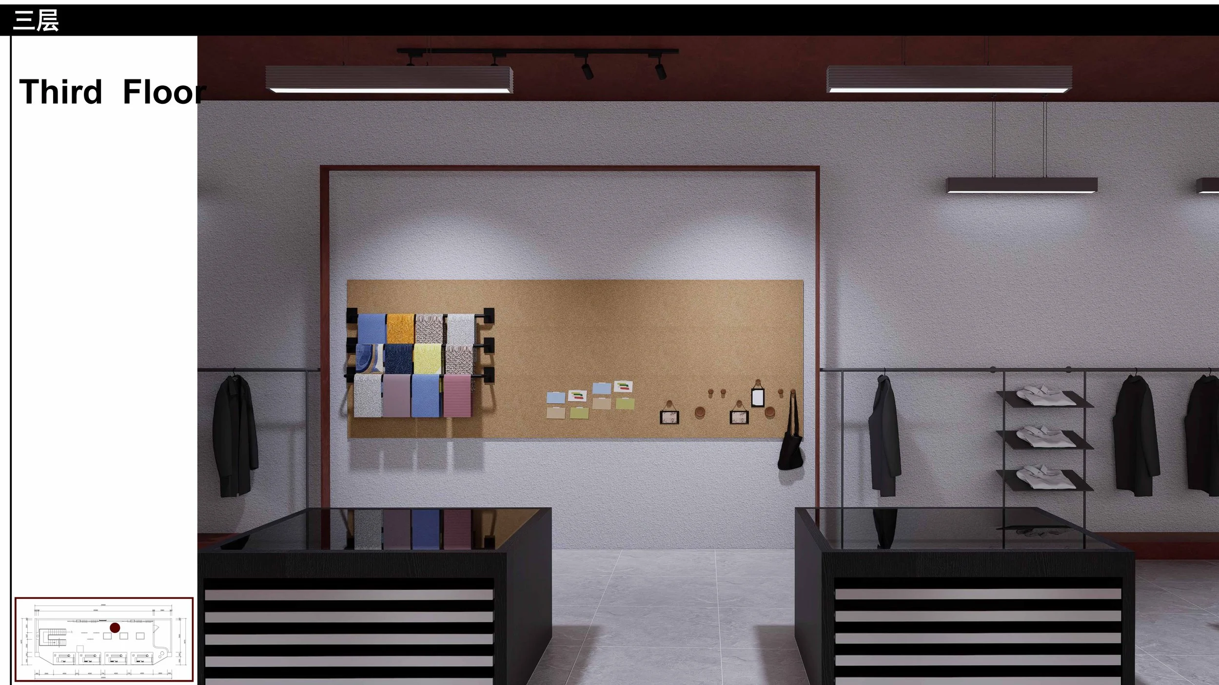
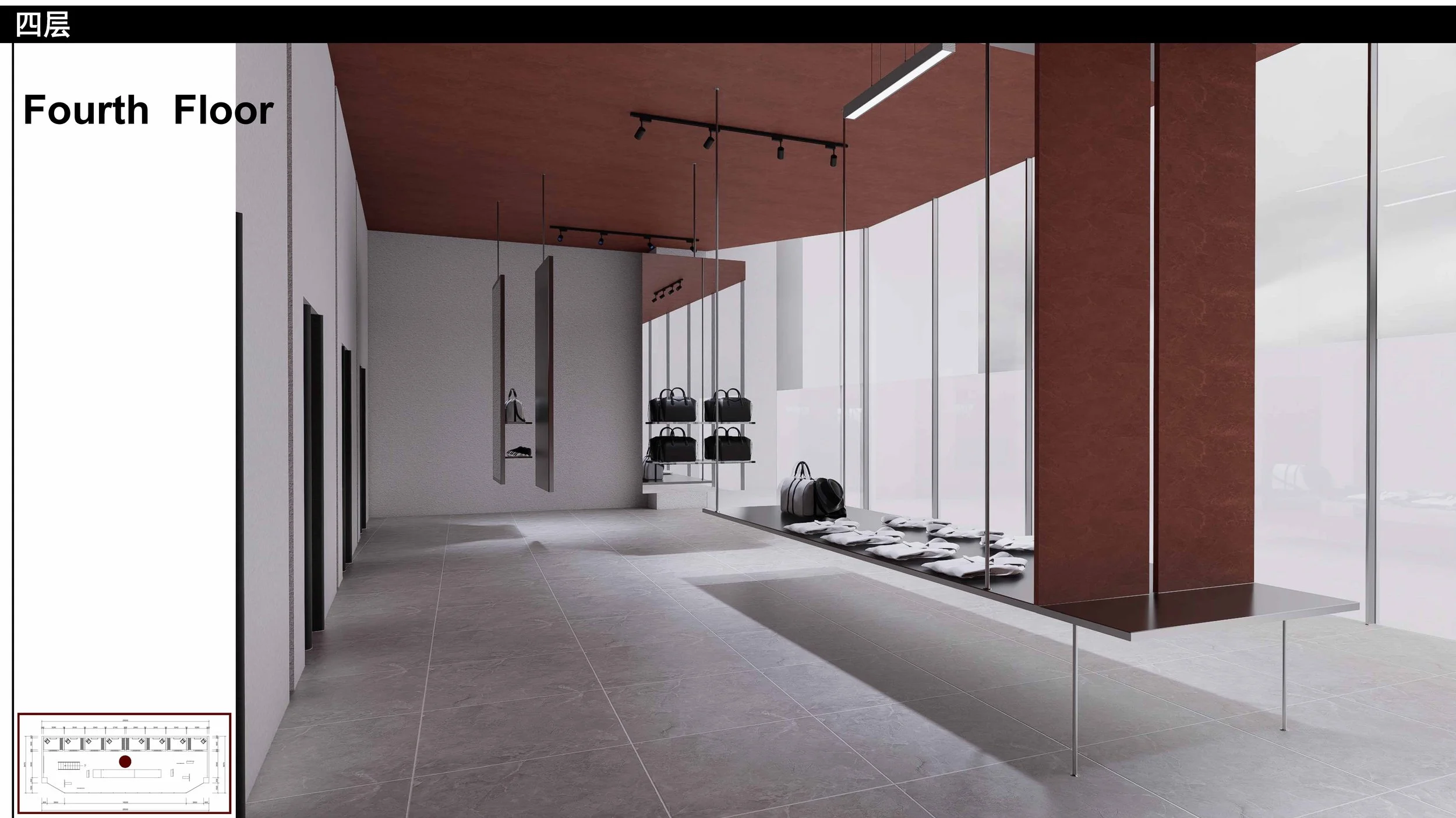
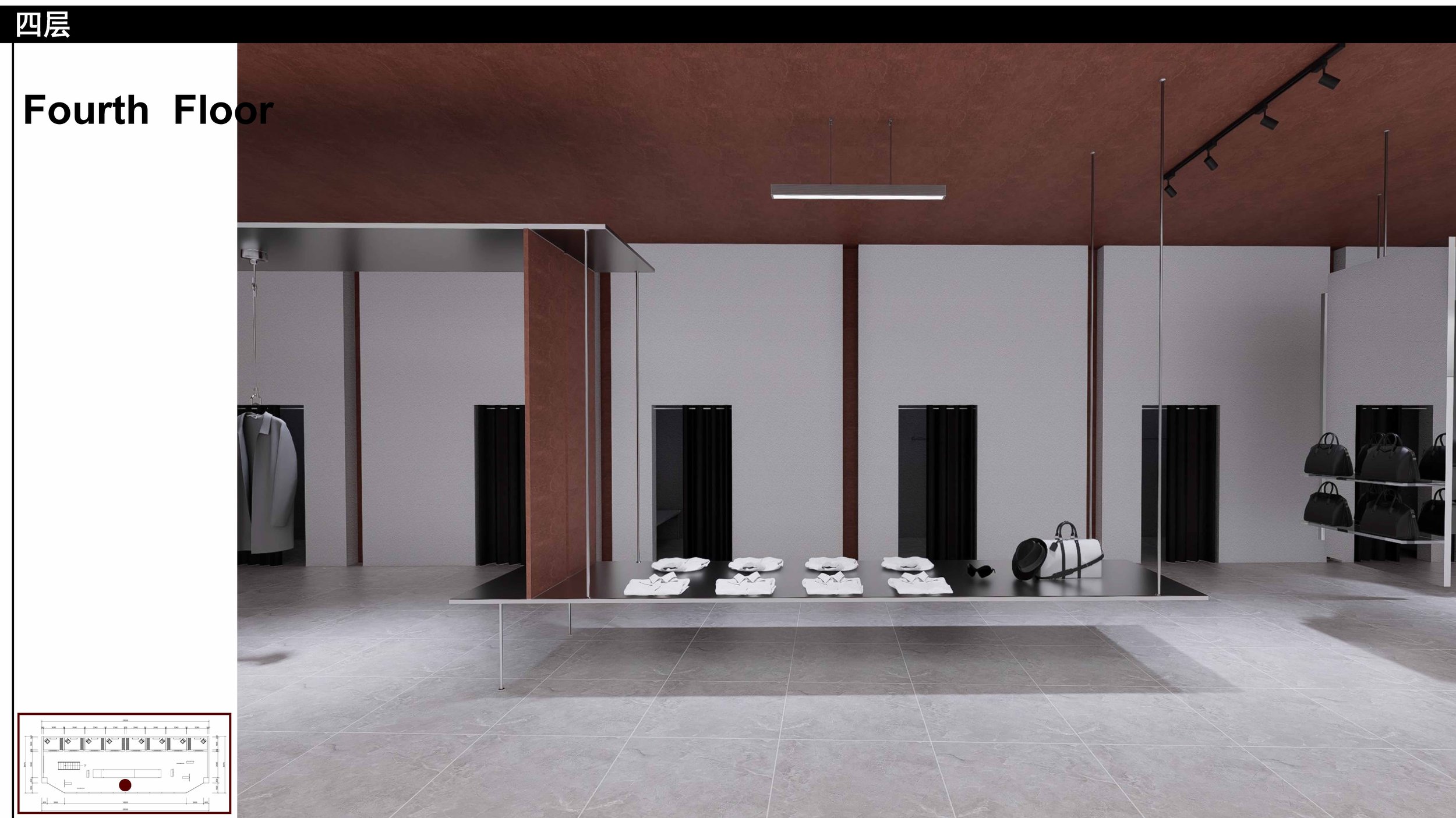
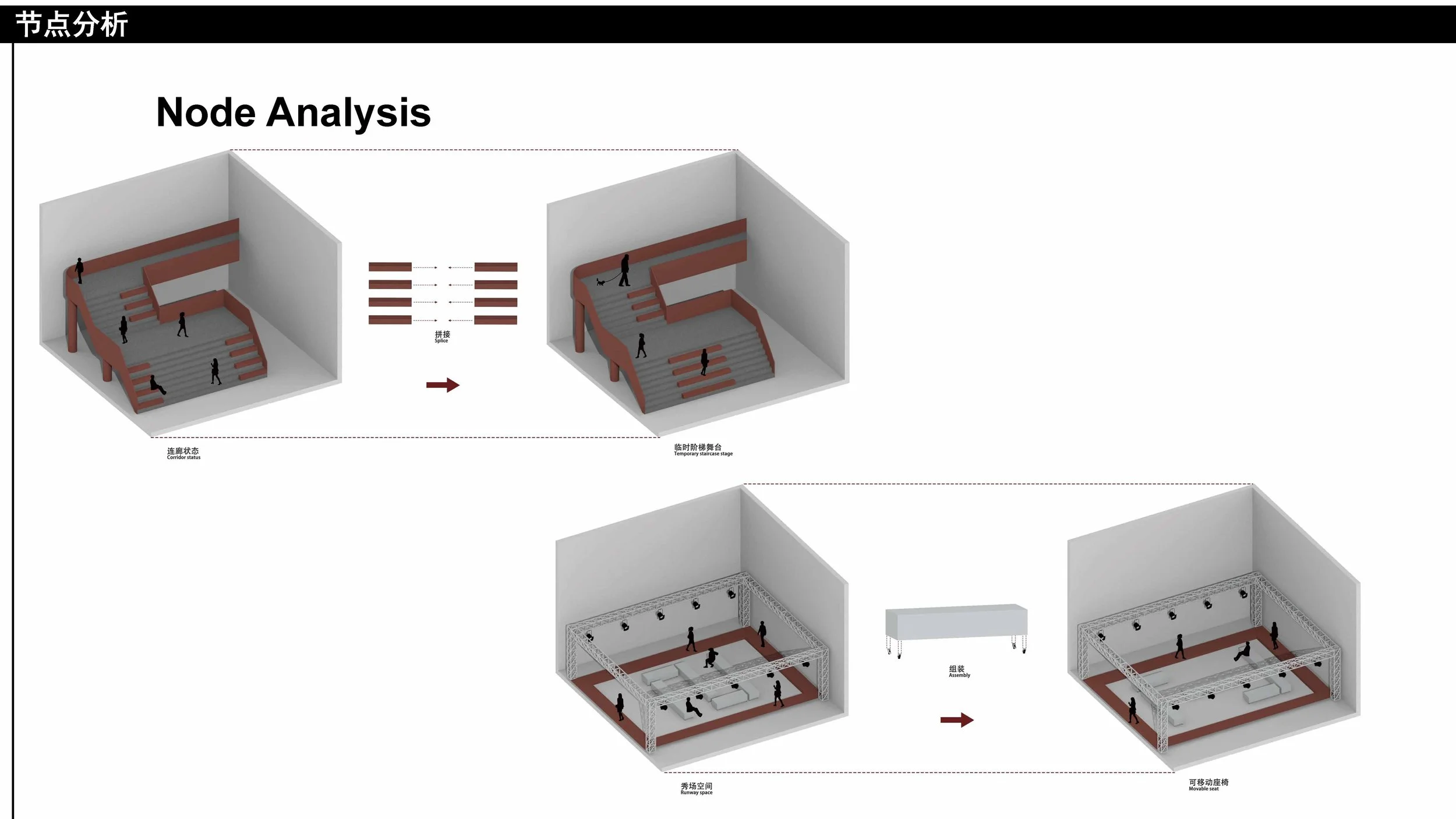
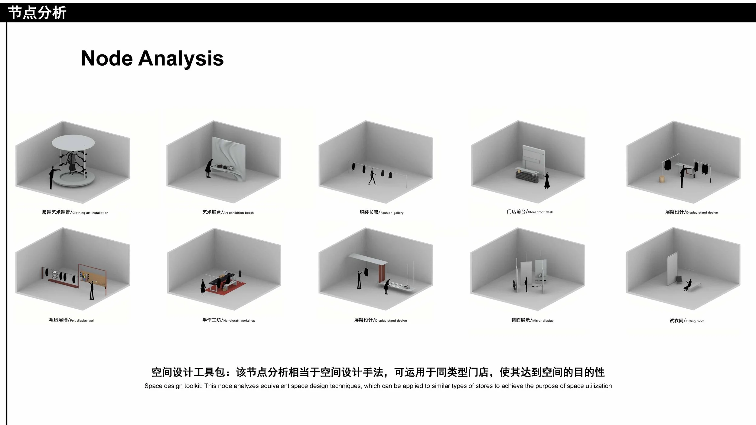
Stitching cultural consciousness and lifestyle: guided by the concept of "fast pace, slow fashion," the project cultivates a multi-format scene where urban relaxation coexists with fashion, allowing spatial repair and district memory to unfold together.
Brand Positioning
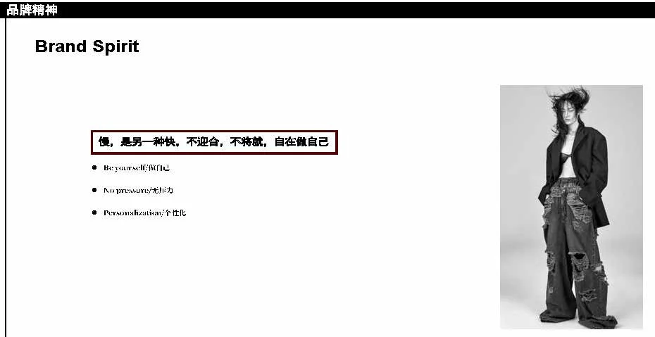
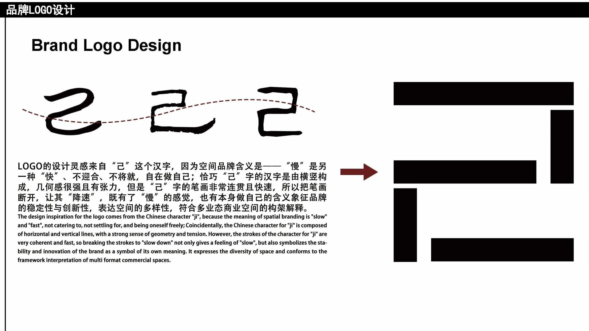
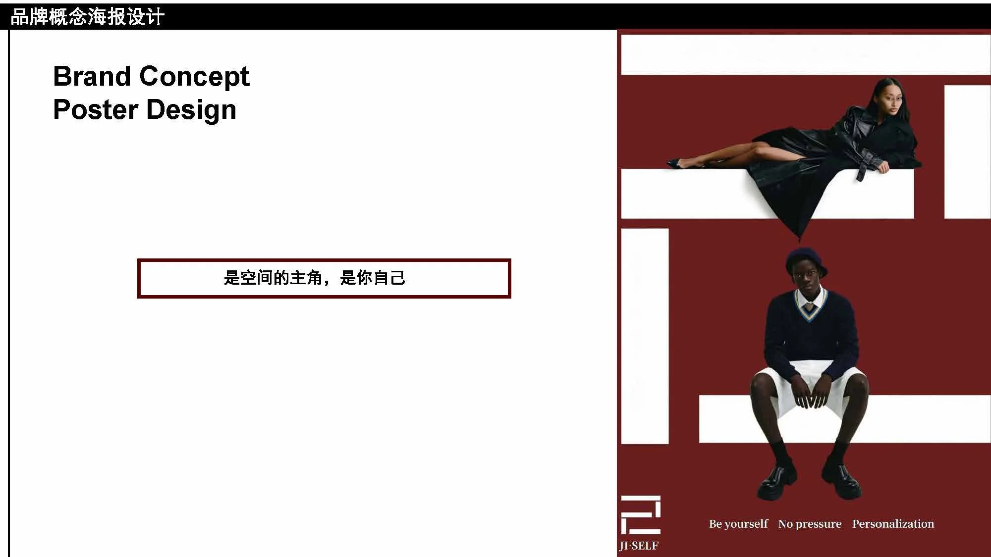
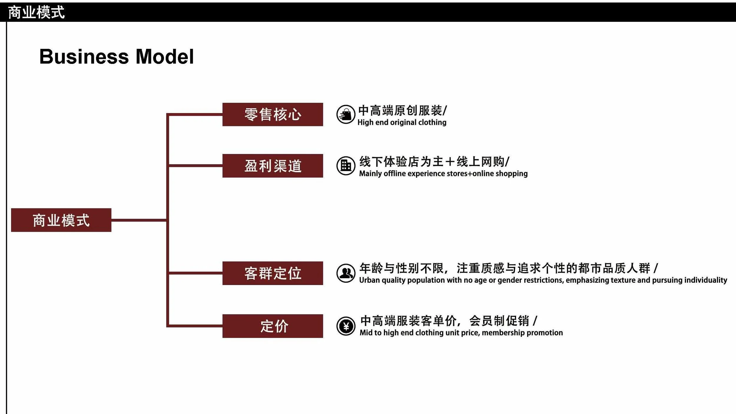
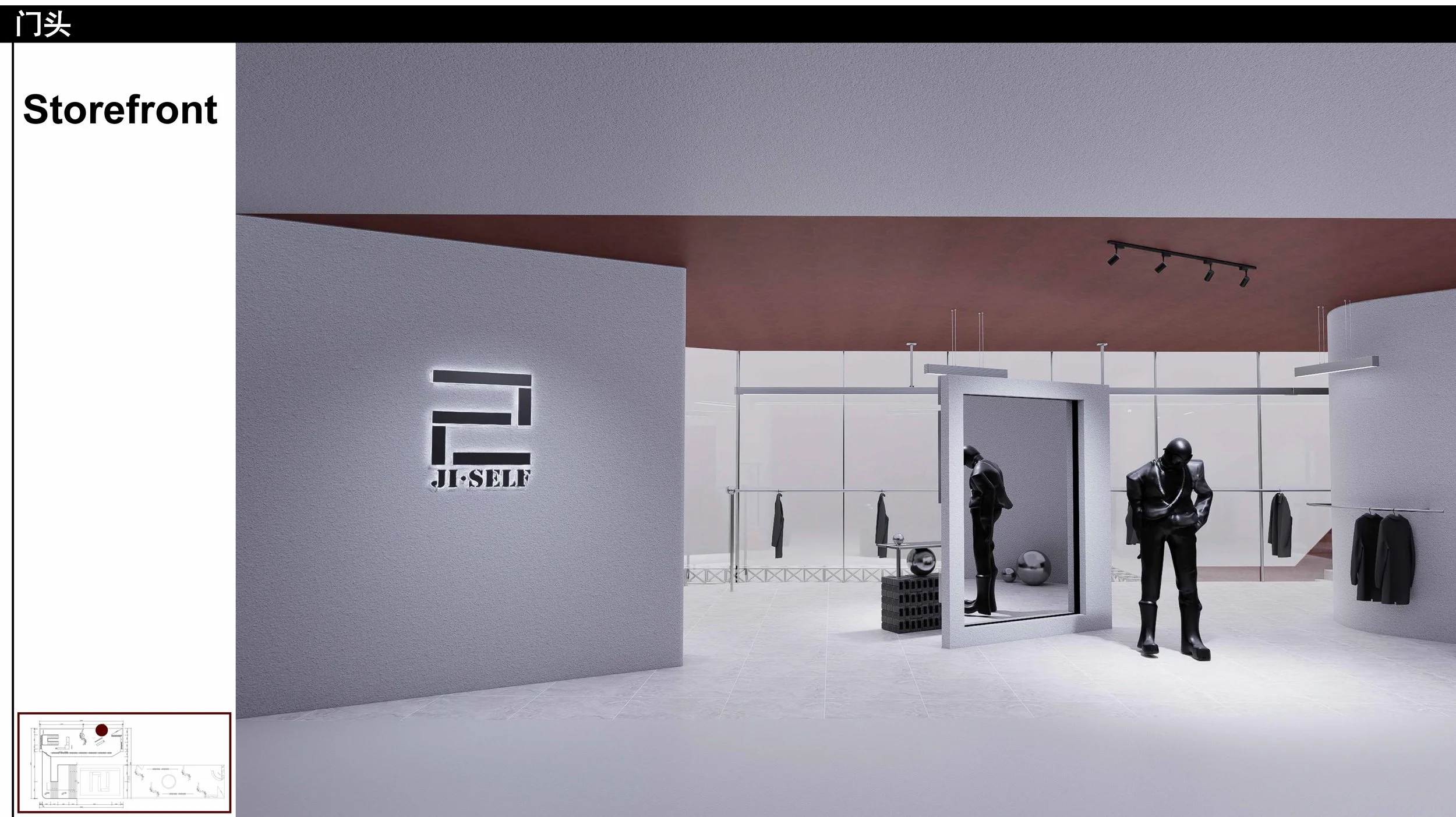
The brand takes the Chinese character "己" (self) as its spiritual origin — "slow" as another form of "fast": no catering, no settling, being oneself at ease.
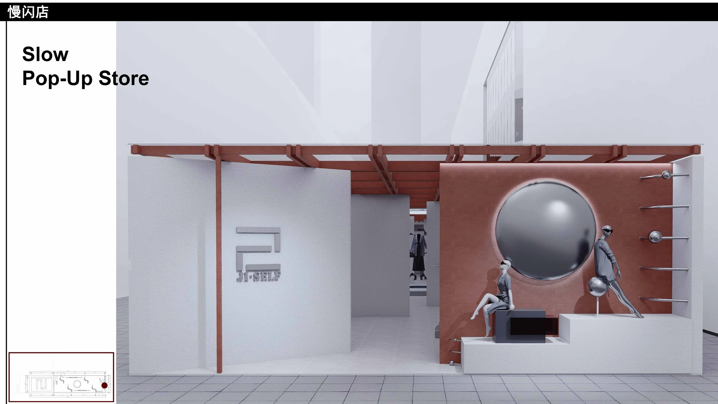
Built from horizontal and vertical strokes, the character is geometric and full of tension, yet its naturally swift, continuous brushwork runs counter to the brand's ethos. The design therefore breaks the strokes apart, "decelerating" the form so that slowness emerges within the fractures — while echoing the character's literal meaning of "being oneself." Broken yet whole, the glyph symbolizes the brand's stability and innovation, its open, architectural language articulating the diversity of a multi-format commercial space.